Tuesday 31 October 2023

Building a webside creating Wix

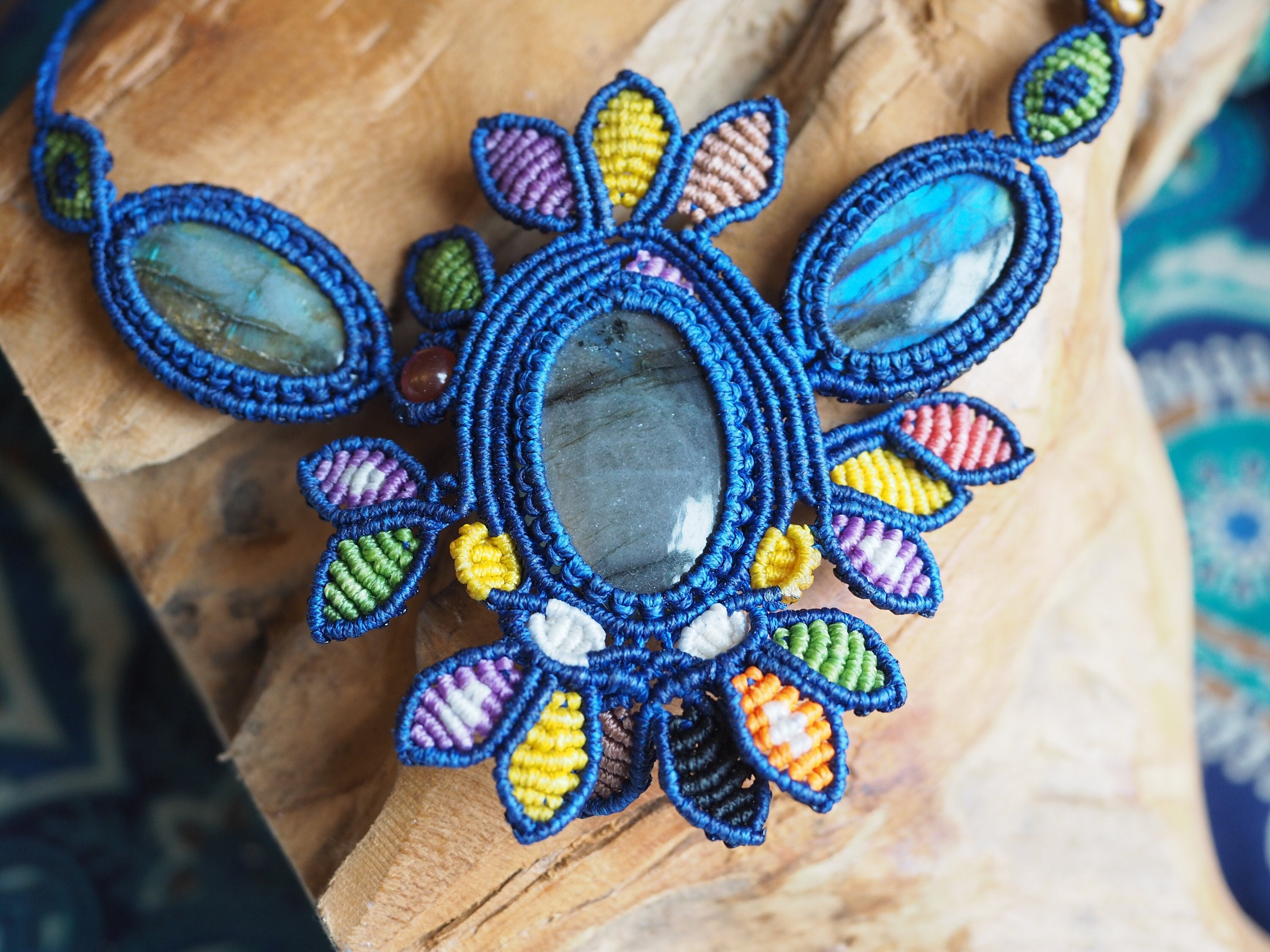
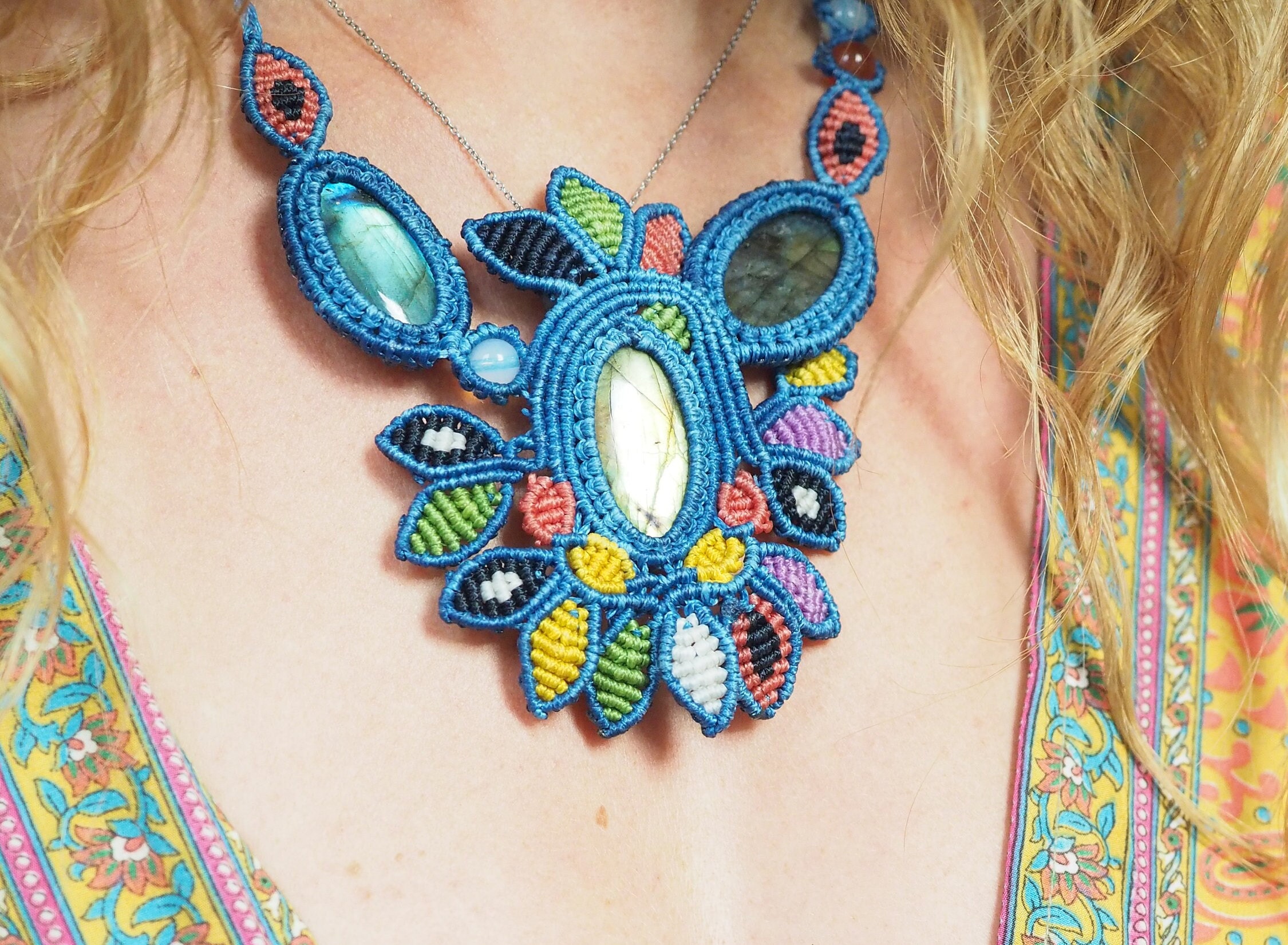
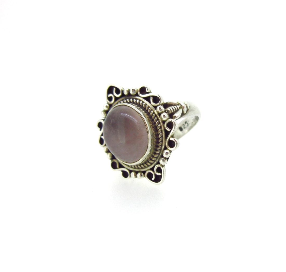
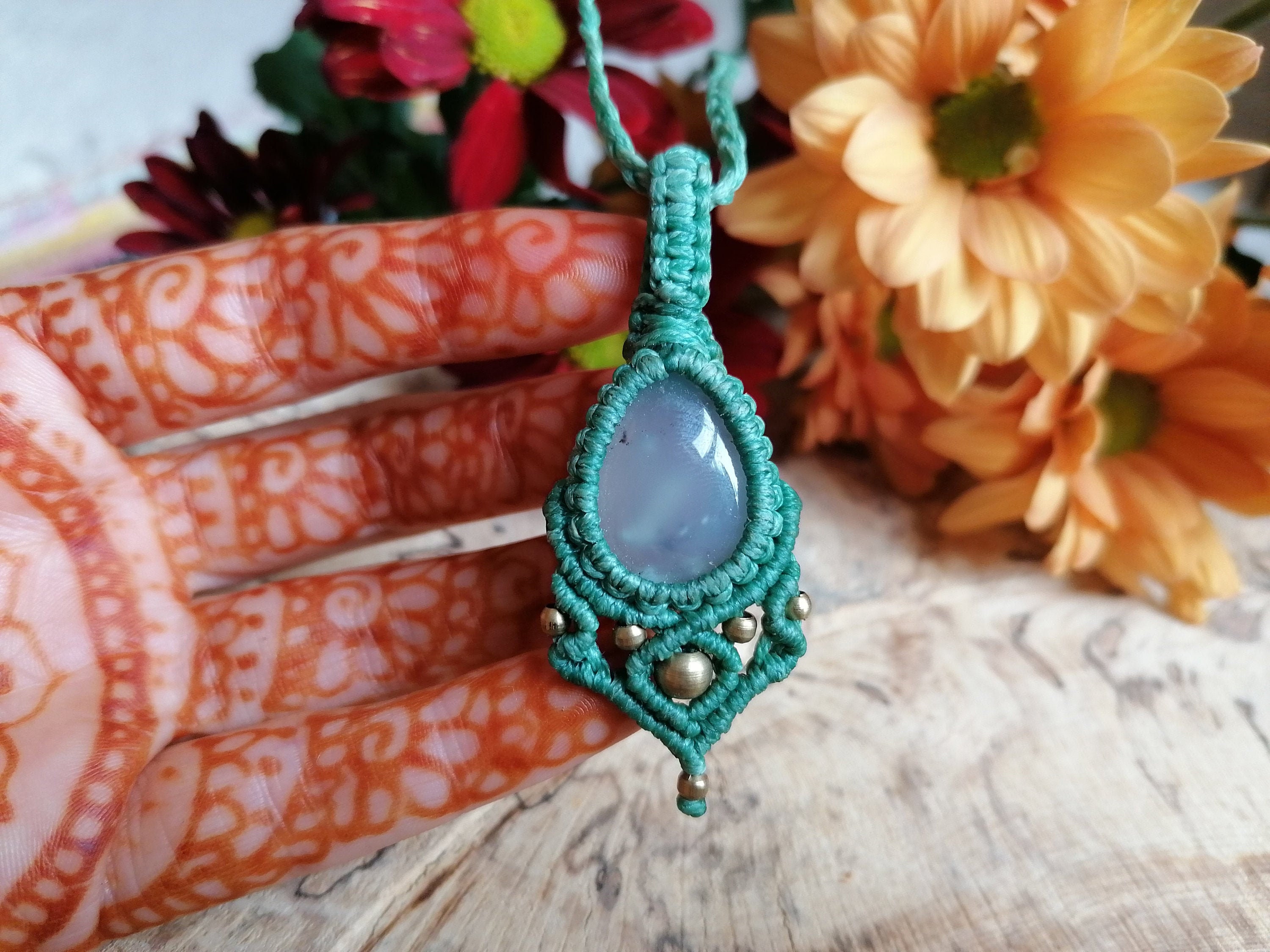
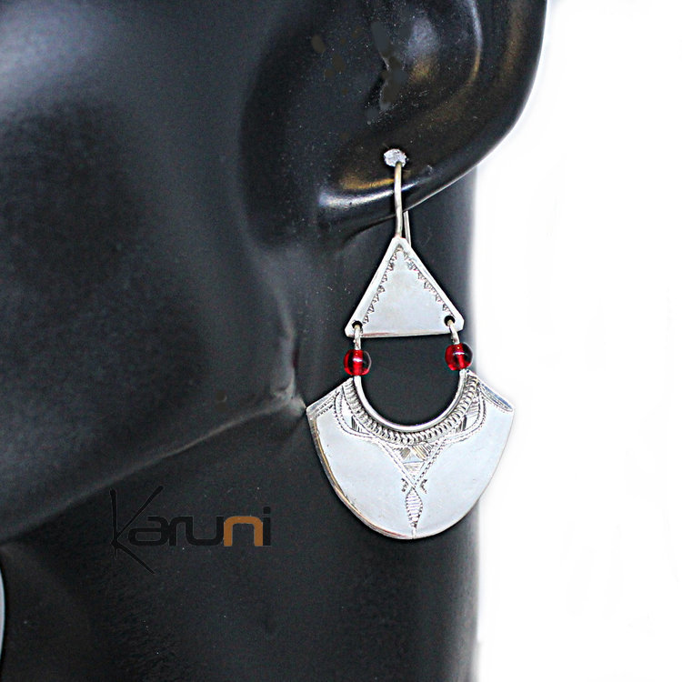
 Today we learned about Wix. Then, we had to use it to create our own website. I chose one for myself from the already ready patterns. First, I decided to change the photos to match my jewelry project, which will be published there in the future. I chose one of my photos as the starting photo. I think it fits the context of the site quite well. I crop them using the editor available in the program's tools.


Then I changed the rest of the images on the website using images from Unsplash. I chose native-themed pictures because my jewelry designs have an ethnic character. This website has a very large variety of choices and, more importantly, using images from this website is completely legal. I think it's worth mentioning.


Once I changed that, I decided to change the font of the text. I chose a font called Kodchasan. I also changed the text size. This font is clear and transparent, which I consider an important aspect for the reader.


I also changed the shape of the vector art from a circle to a moon. I changed its size and color and added the name of my project - Roots Of The Jewellery - as text. However, I think I will put a logo there in the future.


Finally, I added a few sentences in the "about" section to explain the purpose of this page. This section is at the stage of creation, so I will systematically expand it. For my first attempt at creating a website, I think it was a very interesting and enlightening experience. Despite the intuitiveness nature of the program, many technical aspects took me more time than I imagined. However, I am convinced that with each subsequent attempt, the work will be faster and more effective.


Copyright law


Copyright is a form of protection for every creator.
On the government website you can read detailed information on how the law applies to this in the UK. According to information read on the English government website, in order for our work to be protected, we do not have to pay for anything or register it anywhere.  For your convenience, you can additionally mark your work with a special copyright symbol (©)  but this does not affect our rights.(www.gov.uk).
Having copyright to our work gives us the opportunity to protect it from other people using our ideas and designs as their own. In this way we protect our creativity.
Depending on the type of work created, we have a different period of time for copyright protection. For example :
Written, dramatic, musical and artistic work is protected for 70 years after authors death , while Written, dramatic, musical and artistic work is protected for only 25 years after the day it was created . (ww.gov.uk) After this time, anyone can use our work without legal consequences

I can't be absolutely sure that someone won't copy my work and use it as their own, the Internet is too big for me to find everyone. However, I can make sure the person has been warned of the legal consequences of doing so. In this case I can use a note, a special symbol or a statement that will warn the person what the consequences will be.

References: 

Saturday 28 October 2023

Project Sign Off: Roots Of The Jewellery

 I will create a design crafts project which will consist 4-6 jewellery designs. I will hand draw the designs and then I will create a digital portfolio using Photoshop. I will be creating a collection of ethnic jewellery using the theme of Roots Of The Jewellery. I will compete this collection for my website portfolio by the beginning of December


My craft design semester project for Digital Arts will involve designing 4 to 6 pieces of jewelry. This collection is inspired by American Native culture and beliefs. The concept of the project is to refer to the roots of native peoples "Roots Of The Jewellery". The jewelry designs will be hand-drawn and then I will edit them in Photoshop. The final project will be posted on my website for my digital portfolio. The end is expected at the beginning of December.

Initial Research: Princess Mononoke by studio Ghibli

Princess Mononoke is an animated film by Studio Ghibli, created in 1997. The main theme of this production is the eternal conflict between the forces of nature and people. The film shows the tendency of humanity to destroy its home, the earth, guided only by its private interests. (Stephen Kelly, 2022) I had the opportunity to watch Princess Mononoke for the first time when I was a child. I still remember how shocking this experience was for me. The way in which people destroyed everything around them in the name of material goods was the first contact with this type of subject.


This picture shows a young girl with a face decorated with ethnic signs and amulets covered with hair around her neck and head, at the forehead level. If you look closely, you can also notice a specific mask combined with animal fur placed on the back of the head. Her appearance may suggest a strong bond with nature and a warrior lifestyle.

In my project, I intend to be inspired primarily by the aspect of nature. Its importance in the lives of selected groups of people, both in the past and its impact on contemporary life and choices. Nowadays, spiritual beliefs and rituals are gaining popularity. People looking for support, guidance and sometimes answers turn to symbols, primitive religions, astrology or numerology.


References: 

Major Project: SMART Objective


I'm going to use the macrame technique in my project. This technique involves connecting strings together in special weaves using your own hands. These spots have different levels depending on experience. The materials used in this technique are mainly cotton cords (if the creator cares about the good quality of his work), often connected with wooden elements such as wooden beads or wooden sticks. You can also add jute if you want to give your work a rougher look. Raffia will also work great as a delicate and light addition to an ethnic atmosphere.


Ruby Sparrow Design 


Friday 27 October 2023

Milanote Board: Photo Story Project


Every project requires inspiration and research. To clearly present what makes me able to create, I used the Milanote Board program.


Wednesday 25 October 2023

Major Project: Initial Ideas

As my first project, I decided to create hand drawing works of 4-6 ethnic jewelry designs that I will use in my portfolio. For my first inspiration I choose work of Andrew Smith Jewellers. I choose his work because I really like the fact that he adds natural stones in his work, because I also want to use them in my projects. I also admire the minimalist style in is work. 


Next inspiration for my jewelry project will be work of Ruby Sparrow Design. What is really helpful in this artist's work is the fact that they are have jewelry in many different creation techniques. One of the techniques used by them is the micro macrame technique. In my project, I intend to use this technique to design ethnic jewelry., because it gives many color possibilities. 


Ruby Sparrow Design Macrame Necklace


My last inspiration are jewelers made by Karuni. The company's designs are beautiful in their simplicity. Geometric figures and delicate ethnic signs are what I am looking for in my designs. 

All these work are very inspiring to me. I am going to connect the idea of colors with natural stones. I think that combining all of this with geometric figures will give me a interesting effect. I will definitely try to include this one in my work.  As a result, I would like to archive jewelry that gives an ethnic, maybe slightly bohemian vibe. 

Saturday 21 October 2023

Creating Advert: Final Result

 I use Pixlr to complete the advert. I chose one of the basic temples. Then I added the text


Choosing the font was probably the longest process. The final choice was the Bebasneue font.


am very happy with the final look of my avert. The color combination of a green background with very pink text. The whole poster gives a transparent effect and I hope it attracts the recipient's attention 


Creating an Advert: Digital Assets

 I started this project by finding graphics on Unsplash website. I couldn't find a graphic that would perfectly match my original vision, so I had to change it. At first, my vision was a pink background with a pink ribbon, as a symbol of Pink October, breast cancer awareness month. On a website with free images, I found two images that matched my thematic vision.


Then I decided to use the Photofunia photo editing program. I chose Photographs then Polaroid Dress option from the list and there I found my final version for the advert. First, I checked the graphics with Pink Vibes Only, but the effect was not clear. 


It is impossible to read the text from images. So I decided to use a second image. 


The graphics change turned out to be perfect. However, it was not quite what I expected from my final vision of the poster. I decided to look for a solution in the filters available in the program.


I had a lot of filters to choose from, but I chose The Last Warm Day. I think it added a nice warm effect to the entire images and perfectly brought out the warm shade of pink on the ribbon. I am very pleased with the end result. Then add the text and logo from the previous post.


Creating an Advert: Logo Design

 I started working on my advert by creating a Logo. For this I used Free Logo Design program. I chose one of the ready-made Logos and slightly modified it to suit the needs of my project. I changed the background to light pink and the image and text to a darker pink to make it visible against the background.I also changed the font to Calligraffitti

The Logo project 


The Final Logo 


This is what my final design logo looks like. I'm happy with it, it will fit perfectly


Friday 20 October 2023

Creating an Advert: Ideas, Planning

 It is October and till 1985 October has been called Pink October since 1985 as a National Cancer Awareness Month in Brest. I decide that this is what I would like make my advert project about.


In this special month, topics related to the prevention, diagnostics and treatment of breast cancer are discussed. Many famous  brand try to make people aware of how important regular examinations are


It is a poster from 2022 showing several big brands together that decided to support Pink October. 


What unites all poster related to Pink October is :

  • of course the pink color
  • and the symbol of  a folded pink ribbon 
These are the main themes on which  I will focus my attention when I  design my advert project. 


On some posters you can see a slogan encouraging people to take up research. Others include short slogans explain the idea of Pink October. 

Pink October Slogan


Since October is also the Halloween time for many, some designs joined these two things in a slightly humorous way                                                                                                                                          


In my advert, I will try to use a short slogan informing or motivating to take care of yourself.  I think i will also use a pink background because it will be a poster for Pink October and I want it to be obvious at first glance. There definitely will be a pink ribbon motif as well. 

Monday 16 October 2023

The Good Design Research

What makes good design

Dieter Rams, an industrial engineer from the 1970s, believed that good design is characterised by: 

User-oriented

Our design must be created for the user. Putting his needs and visions first. At the same time, making the project legible and accessible.

Innovative

A good design should be surprising, striking and give a breath of freshness. Going beyond the norm may be risky, there are regulations everywhere, but thanks to this you will get results that are worth bending them if necessary.

Aesthetic

This may seem a matter of taste, but good design should be easy to understand and pleasant for the masses. Thanks to the appropriate selection of colours and fonts, you can make the design pleasant for the target group. A good design should encourage and attract the attention of recipients. (kimp.io 15 Jul,2021)


What is Typography 
Typography for the style, appearance of the text. Each font has its own purpose, for example we will not give the text "be careful, dangerous" in a comic book font. Typography is the beautification of text, using separation between letters, spacing between lines, colours, layout styles and other elements. (edu.gcfglobal.org)


A Designer

Alan Fletcher was a British graphic designer. The designs he made are very clear and eloquent in their simplicity. I like the way he p layed with font and color in a way that can interest the observer without overwhelming him. Many of his works are still in current use, which shows the timelessness of his works.
 ‘Design is not a thing you do. It’s a way of life’ Alan Fletcher

Design and Layout

Layout design is the arrangement of visual and text elements in design in a way that is transparent, legible and encouraging to the viewer. At the same time, providing information in an attractive way.

There are 5 elements that any designer should use :
  • Text
  • Image These can be photographs, illustrations as part of the design. The right choice of size or topic can attract recipients' attention or convey content without words. 
  • Line The use of lines in design can help bring to the fore the element that we want to highlight in our work and direct the viewer's eye. Lines can also be used to mark boundaries between elements
  • Shape
  • White Space Empty space in the design can help make a given element stand out or make it more readable to the recipient. This may turn out to be as important in the project as the visual elements themselves. (David Carson, 7 June 2021)


Using text and image in advertising

If we add too much text to our project, there is a chance that many people will not read it to the end. It is important to convey the content using as little text as possible. (Eric Jones, 9 January 2023)
A good example is the poster announcing the last part of Harry Potter, in which the name of the film was not used and everyone knew what the poster was about.


What is a tagline?

This is a short description of the brand. Most often in the form of a one-sentence slogan used to describe your brand, such as Nike -“Just Do It”. A good tagline can arouse interest and help understand the brand's ideology (Andy Fuller, designbull.co.uk )


What is a Logo?

A logo is a visual description of the company. It may contain colors or characteristic inscriptions that are associated with the company's products. A well-matched logo will allow the recipient to connect the logo with a given company and its products. A logo made in an interesting way may encourage the recipient to check out the brand, even if they have not heard of it before. This may be an element of good marketing for the company. (vocabulary.com)


The message in advertising

An advertising message is a way for a brand to communicate with its recipients. Good communication of the benefits of interacting with the brand - whether by purchasing its product, registering or making a reservation. Good execution of such a message can bring many benefits, such as a large response from recipients, understanding your target group, increasing sales or developing the brand. (sendpulse.com 21 March 2023)


Methods of getting your attention in advertising

There is few of methods that can be use to get attention, such as: 

  1. Rule of thirds and the golden ratio
  2. Color psychology
  3. Testimonials
  4. Placement and typography
  5. Visual path
  6. Association
  7. Emotion
  8. Demographic positioning
  9. Symbolism
  10. Personification
  11. Realism
(Daniella Alscher, 11 March 2022)


Reaching a Target Audience in advertising

Target audience is a specific group of people for whom we design. we will design differently for children and for adults, for example we will choose a different font and colour.  The following quote describes it exactly as it is. You cannot understand good design if you do not understand people; design is made for people” Dieter Rams during a speech in 1976

(ceros.com Mark Healy 2016)


If we cannot verify our target group, we can do it in a few sample steps:

  • Interview your customer
  • Audit your social following
  • Review your marketing performance metrics
  • Take notes on your competition
  • Define who your target isn’t
(Céillie Clark-Keane, 8 September 2022)


References:


Sunday 15 October 2023

Sequential Images : Sebastião Salgado Reaserch

Sebastião Salgado was born in Brazil on 8th February 1944. He was trained as an economist. By a delegation to Africa for the company he was working at the time sparked his interest in photography. His photos depict people living in a difficult economic situation. However,  he present his characters in a human way, without giving them the superheroes characteristics or asking for mercy. He shows the reality of the Third Word without exaggerated narratives(Lisa Hostetler, 1999)

Miró (Viná) Yawanawá, Rio Gregório Indigenous Territory, state of Acre, Brazil,
 2016, gelatin silver print, 24 x 35 inches/61 x 88.9 cm © Sebastião Salgado


Sebastião Salgado creates black and white photos. This portrait shows a man with an interestingly pained face. On his head we notice a headgear, like a scarf, but what attract attention are the bird parts built into the scarf. His portraits are unusual due to the differences of the people he photographs. It is hard to ignore them.  


This intense portrait of Bela Yawanawáfrom the Mutum village is one of many artwork in the series in Magnum Opus. The photos shows a woman with huge headdress made of feathers. However, what attracts attention in the long run is her penetrating look and face, painted in a specific way. 


Sebastião Salgado

Dinka group at Pagarau, Southern Sudan, from the series Genesis, 2006


This is a photo from the Genesis series, which focuses on showing people in their natural environment in the best possible way. These are people who still live in harmony, according to the traditions and cultures of their ancestors. (yanceyrichardson.com)


References 


Reflection: Art Portfolio 2

     In Art Portfolio 2, I learned techniques for developing ideas. The classes showed me how to evolve,  my ideas, and change and improve ...