Wednesday 28 February 2024

Class Presentation


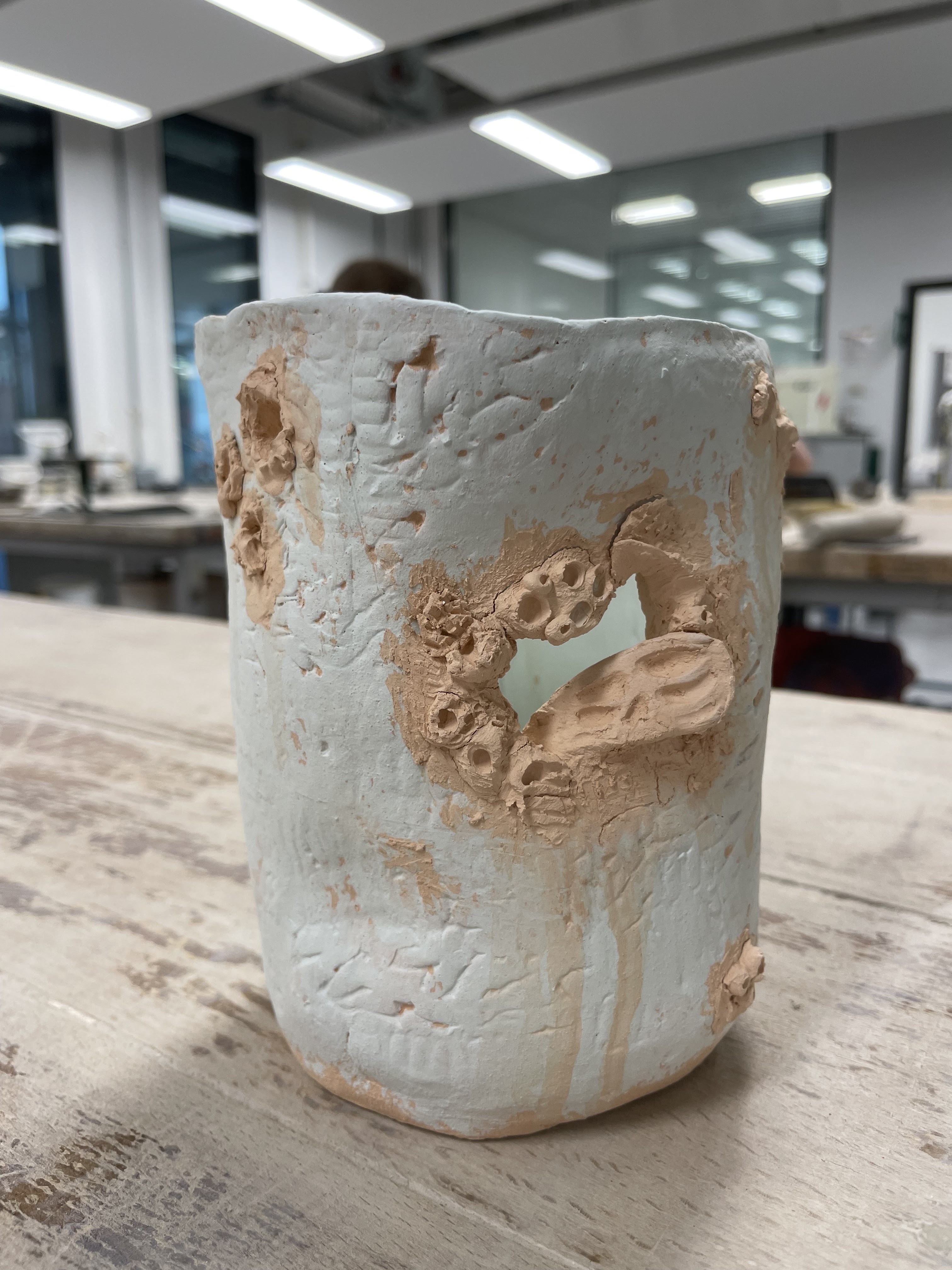
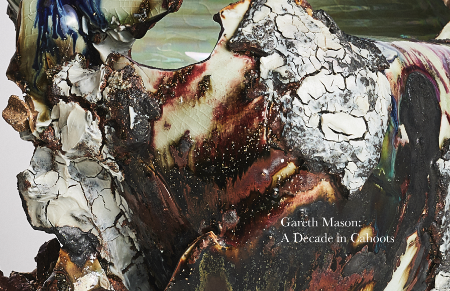
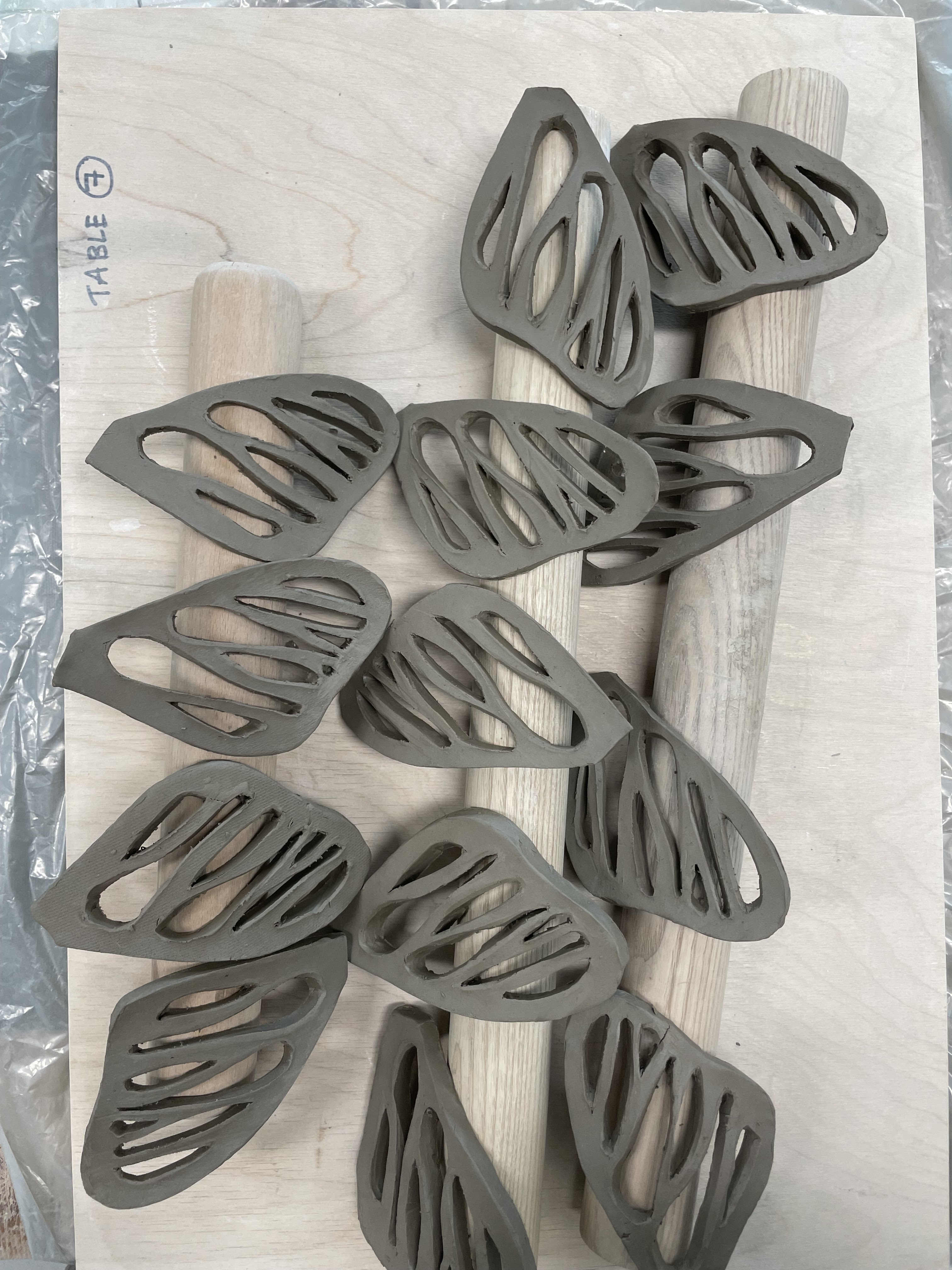
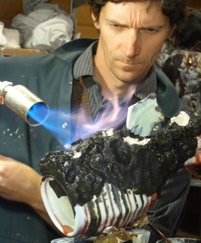
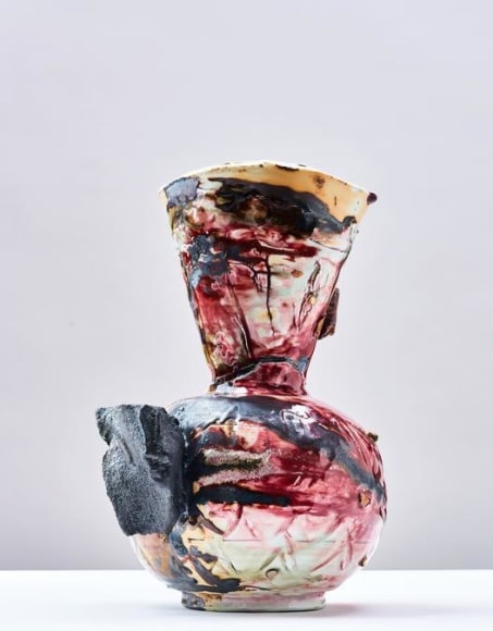
 In week 7, we were tasked with making a short presentation in which we would present our progress at work and in the group so far. To better show my current progress and the inspirations I used when creating, I printed current photos of my works. Then I attached them all to the wall, along with drawings and printed paintings from the Impressionism and post-Impressionism period, which were also my color inspiration. The presentation wall also includes photos of insects and works by famous ceramic artists. It will make it much easier for me to convey information, and I think it also helped my friend visualize my projects. I also take into account mistakes (broken butterfly wings) and processes that significantly improved the appearance of my works, giving them a professional look (smoothing using a wet sponge). 

Third Ceramic Project: Progression


The third, and last, work is also getting closer to the final result. After the first firing (called bisque), the vase took on a delicate greenish colour, while the vase that did not have the underglaze applied took on a delicate orange shade. The streaked effect gave the whole thing an expressive effect. 


My next step was to highlight the texture. For this, I used orange oxide. Then, using a damp sponge, I wiped off the excess colour. Thanks to this process, recesses and reflections on the material were highlighted. The moth shape I obtained using ready-made stamps now looks like the old-simple image. The orange colour reminds me of the colour of caves, and the shapes of the insects look like primitive paintings. The whole thing took on a primitive look, which is satisfying because of the theme I chose - primitivism.


Second Ceramic Project: Progression

My second project at the burnout stage in the kilt took on a distinct blue colour. As it turned out, not all parts had been painted thoroughly, and in some places, there were visible spots of the raw colour of the ceramic mass (a shade of beige colour). This time I used clear glaze for glazing. 


Thanks to this treatment, I achieved a shiny effect without changing the colour. I chose the glaze from this type of effect due to the next process, which was the use of a product called Mother Of Pearl. It is a lustre, and that achieves a shine resembling a pearl-like visual effect. 


The consistency of the lustre is oily. Before applying it to ceramics, make sure that the brush is completely clean. It is then applied to glazed, fired ceramics. 


Once fully applied, you can see how the mirror darkens the blue colour. However, the final effect will be visible after the next firing. This time it will be fired at a lower temperature.
 

First Ceramic Project: Progression

 
The next step in my first ceramic project was to create a glaze with a cracking effect. Using the recipe with the ingredients and their weights, I created a mixture ready to be mixed with water. I rounded each product weight to the whole to make work easier. For example, if the weight of the product was 37.8g, I marked it on the card as 38g. The final weight should be 100g, which I mixed with 100ml of water. I mixed the finished mixture thoroughly using a small spoon. Then I dipped the prepared samples (bisque) in the mixture. As for comparison, I created two separate glazes that were supposed to give a different cracking effect, I signed them from the bottom with a crayon (the pen disappears during firing) so as not to confuse them.

Then the samples were fired again in a kiln at a temperature of 1260℃. As you can see in the attached photos, the effect was barely visible. I had to look very closely to see anything.


The next day I asked a technical employee for help. As a result, the next samples were dipped in the glaze, but this time, after putting the samples into the glaze, we counted down to five seconds. Then we waited for the glaze to absorb, dry and immersed it again, this time counting to three. As you can see, the effect is much more visible. I decided to use both versions for my project. I used the first one from the left for the bottom part of the design, and the second one for the top. I chose that version because the upper part currently has a visible texture (due to the use of stamps) and the lower part has a smooth texture. I decided that the version with more visible cracks would look better on a smooth surface.


 This part taught me what the process of preparing glaze looks like. It is not, as I thought, a ready-made mixture. This process requires accurate measurement of ingredients.


Website: New Wix website


In today's class, we were asked to review our website. Last semester, I wasn't entirely satisfied with the appearance of my website. This semester I decided to work on it. I was not satisfied with the effect of scrolling like slides instead of redirecting to a separate page. It turned out that Wix does not offer the option to change the template. which meant that I had to create a new website.


I copied the first portfolio from the old website, consisting of jewellery sketches. I also copied the "about me" part and the "The Galgankowo" logo. I decided that the name "Roots Of The Jewellery" is more a description of my jewellery project than a general description of my crafts. This name comes from Polish - "galganek", an old term for hand-sewn dolls.


I intend to replace the home page photo and the "contact" section with photos of my own works. I will wait at this stage until the ceramic work is finished. I will use photos of the product or part of a photo taken during the final photo session.


I also decide to change the "about me" part. In the previous term, I was suggested to work on it. I added a few information about me and changed the font size so that the page doesn't look blank. 

Monday 26 February 2024

Project Working Plan

Project Working Plan 

This is my update for the Project Working Major Plan 


Week Five: Develop the ideas - work in the ceramic workshop: done
Week Six: Technical Research about the epoxy resin: still haven't finished my ceramics, so if I have enough time I will do it, but maybe I just left that idea
Week Seven: Experimenting with the ideas and working on 3d aspects of the projects: done
Week Eight: Finish all my 2d projects: In the process, I already make some backgrounds for my 2D in Fine Print Workshop using a mono print technique 


Sunday 25 February 2024

Research: Target Audience


My target audience will be mainly people from the Millennials and above. Since my ceramic designs are mainly home decorations, my recipients will be people who have their own homes or are just buying them and want to decorate them. 


As statistical data (statista.com) show in the UK, in recent years the average age range of people buying houses has been 29-32. Statistical information shows that it can be assumed that everyone over the age of 32 owns their own home. This is the group of people he is looking for for his projects.

Trends for 2023/24
My works are handmade, and my target audience will be people who appreciate this type of work. According to Lasers (2023), handmade ceramic decorations are back in trend. The fact that these are handmade works and cannot be reproduced twice makes them unique and adds character to the interior design. Also, due to the insect motif I chose and the primitive period, my audience is limited to people who want to decorate their home space in this way. My decoration designs would work well in a house decorated in a rustic or boho style, I think that a minimalist vision of the interior would also work in this case. Home decoration trends for 2023/2024 also include motivating nature and colours inspired by nature. I believe that my ceramic decorations are suitable for these trendy frames. 

Also, the fact that the materials which I create come mainly from recycling and are environmentally friendly puts them in a good light for people who care about the planet (J.J,.I. Manas, 2023). This distinguishes them from mass productions, which are imported (mainly from China) and sold for small amounts. People are becoming more aware of the consequences of consumerism and cheap, recycled items, not only in the decoration area.


Reference List: 


Lasers, B. (2023). Decoration trends 2024 ➡️ What’s popular? [online] Mr Beam Lasers. Available at: https://www.mr-beam.org/en-gb/blogs/news/decoration-trends-2024 [Accessed 26 Feb. 2024].

Smith, A. (2023). 2023 Interior Design Trends: Nature-Inspired Looks Are In - RealRender3D. [online] www.realrender3d.co.uk. Available at: https://www.realrender3d.co.uk/2023-interior-design-trends-nature-inspired-looks-are-in/ [Accessed 26 Feb. 2024].

Manas, J.J.I. (2023). 9 recycling trends to look out for in 2024 - Plastic Bank. [online] plasticbank.com. Available at: https://plasticbank.com/9-recycling-trends-to-look-out-for-in-2024/ [Accessed 26 Feb. 2024].


WMW. (n.d.). WMW | Plastics recycling market set to grow big. [online] Available at: https://waste-management-world.com/resource-use/plastics-recycling-market-set-to-grow-big/ [Accessed 26 Feb. 2024].

Statista Research Departamen (2024). British first time home buyers: average age in 2011-2021. [online] Statista. Available at: https://www.statista.com/statistics/557901/first-time-home-buyers-average-age-united-kingdom/#:~:text=Since%202011%2C%20the%20average%20age [Accessed 26 Feb. 2024].

Thid Ceramic Projects

My third and last work was not inspired by any specific insect, as was the case with previous designs. I decided to use the insect motif, generally. the performance was inspired by the artist: Gareth Monson and his works. The colour inspiration for this project was the painting "Sunset" by Claude Monet.

                                             Gareth Mason,"Tomb Warden", 2016-2017


My idea was to create an object resembling a vase, one with an open space at the top. I used the slab method to create the object and glue the parts together. On the outside, using ceramic rollers, I made patterns that were supposed to resemble patterns from insect wings.


Then I cut out patterns of insect parts from paper, which I then used to cut out my vase-like project.


For the underglaze application process, I used a sponge to obtain unevenly applied color.


The cut-out shapes of butterflies seemed to me too "perfect" shapes for this type of project. So I decided to make them look more primitive. The current appearance of the work is closer to the effect I intend to achieve in the end. As I needed water to change the shape of the holes to soften the mass, there were streaks all over. However, I'm considering leaving this imperfect look.


 After the process of changing the butterfly-shaped holes, I think that the whole thing has a more three-dimensional look, and more texture.


Reference List:

Wikipedia Contributors (2019). Impression. [online] Wikipedia. Available at: https://en.wikipedia.org/wiki/Impression.

Mason, G. (2020). Gareth Mason: A Decade in Cahoots. [online] Available at: https://www.jasonjacques.com/attachment/en/583dd7dc84184ed07e8b4568/TextTwoColumnsWithFile/5f6262cb3cc1388c0544a0c7/additionalFiles/5f80d0d93ac138795dbc800b/translatedAdditionalFiles/5f80d0d93ac138795dbc800c [Accessed 25 Feb. 2024].


Artist Research: Gareth Mason


In G. Manson's works, you can see, above all, rich texture. It includes many processes in its creation, which give a multi-layered and unique effect. He is one of the most original British ceramicists, whose work attracts constant attention. His exhibitions are highly appreciated. The artist inspires his works with the earth, as he says himself, it is his artistic medium (jasonjacques.com, no data). 

I chose this artist as the inspiration for my project because of the primitive look of his works. Through many forms and cardboard that overlap, as well as non-obvious shapes and recesses, he achieves a very primitive appearance in his works. I was captured by this non-obviousness and the expression that distinguishes Manson's work.


In his works, the colours and the expressive way of applying them make his works bring to mind primitivism and uniqueness. He uses many materials at the same time for his works, among others stoneware, porcelain, slips, glazes, slate inclusion, feldspar, fluxes, and stains (jasonjacques.com, no data).

Reference Lists:

www.jasonjacques.com. (n.d.). Gareth Mason - Contemporary - Jason Jacques Gallery. [online] Available at: https://www.jasonjacques.com/contemporary/gareth-mason [Accessed 25 Feb. 2024].

Mason, G. (2020). Gareth Mason: A Decade in Cahoots. [online] Available at: https://www.jasonjacques.com/attachment/en/583dd7dc84184ed07e8b4568/TextTwoColumnsWithFile/5f6262cb3cc1388c0544a0c7/additionalFiles/5f80d0d93ac138795dbc800b/translatedAdditionalFiles/5f80d0d93ac138795dbc800c [Accessed 25 Feb. 2024].

Materials


The materials I use come from the DMU ceramic workshop. The technicians who work there download their materials from "Valentines Clay". The ceramic mass is called "Buff Stoneware" and is baked at a temperature of 1260°C. Its total weight after baking decreases by 9%, which is worth keeping in mind if we want to create something with specific dimensions. If any waste remains while students create their work, it is reused. There are specially described baskets for this purpose. So, everything is recycled for reuse.


Underglaze is available in several colours. If anyone needs a colour that is not available, it can be purchased at the ArtGalleryShop, which is located in the academic building. Below, it shows the colours I used. As you can see, they have pieces of pottery attached, which are already fired and glazed. This is done to show how the colour behaves when one, two or three layers are applied to the ceramic mass.


Tuesday 20 February 2024

Second Ceramic Project: Continuation


In my next step to build the second ceramic model, I used a pattern made of a sheet of paper, resembling a moth's wing. Then I used a knife to mark the places to be cut in the ceramic mass. I use a small knife to cut out the marked parts and, at a later stage, water to smooth the edges after cutting. I left the mass overnight covered only with a bag, which made it harden more than I expected. This made the cutting process much more difficult. Next time I would use the space designated for this (name!).


Once I had all the parts ready, I started putting them together. Inspired by the work of George Bowes, I decided to make a decoration in which the wings will be placed horizontally, connecting with each other. Due to the dried ceramic mass, this process was not easy. I decided to use water in the spray bottle to slightly wet them, which made them more flexible. I managed to create a 3-level object. Join the wings together using ceramic mass and wet clay (ceramic mass mixed with water) to stabilise them.


Once I had the look and stability, I moved on to the visual stage. Using a sponge and a bowl of water, I smoothed the structure of the wings. I am posting photos below showing the difference this stage makes. The next step is to leave the object to dry completely, use underglaze in the selected colour and bake it in a kiln.


I wanted to show what the parts looked like that turned out to be too hard during the cutting stage. This mistake taught me a lot. Now I know I could have used a water spray to try and freshen them up. However, I will now glue them together and use them to make samples for colour and glaze.


Reflection: Art Portfolio 2

     In Art Portfolio 2, I learned techniques for developing ideas. The classes showed me how to evolve,  my ideas, and change and improve ...