Thursday, 16 May 2024

Develop of 2D outcomes


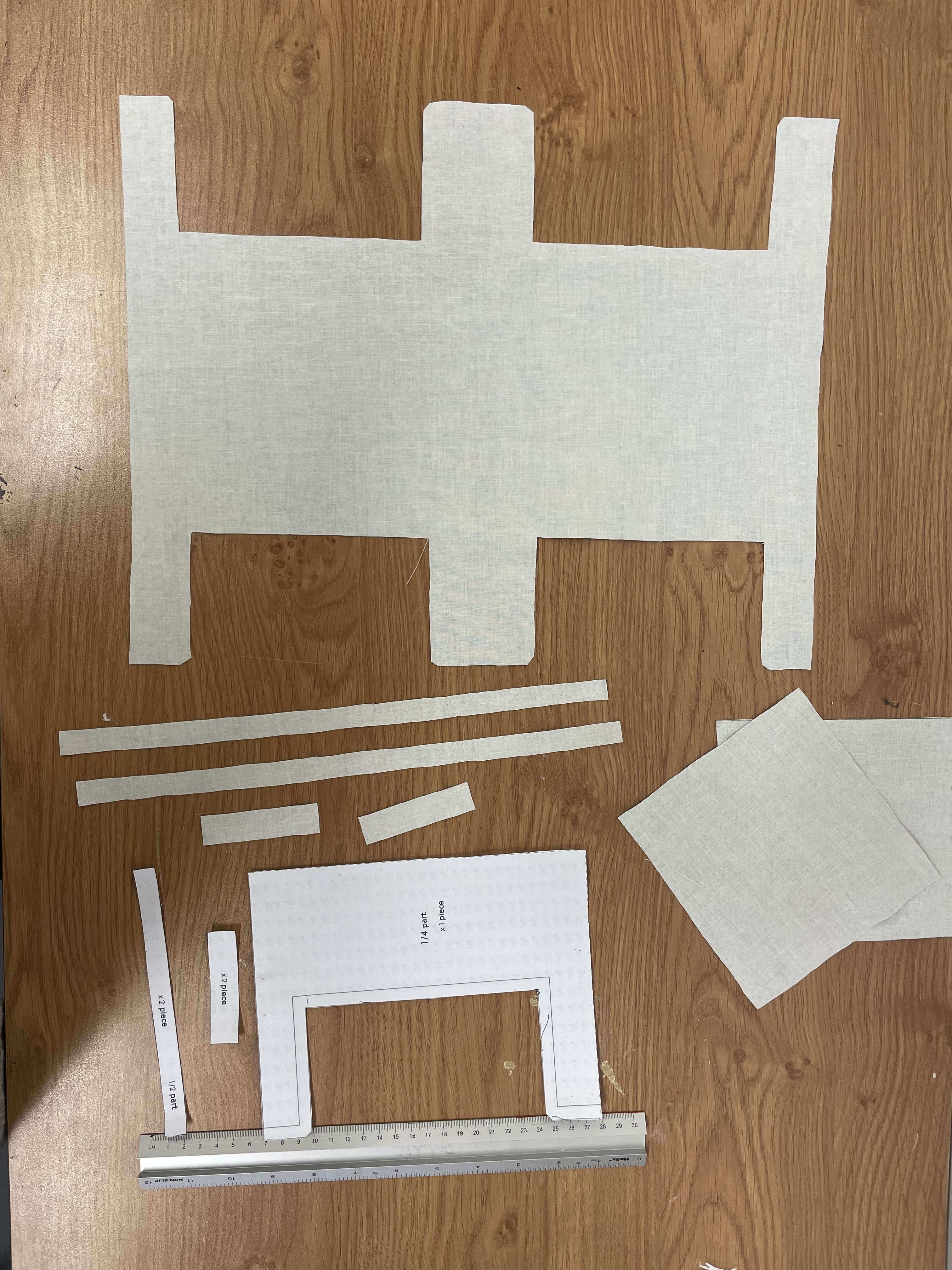
    First, I use the Sketchbook application on my tablet to draw initial designs for a small makeup case and a tote bag. I try to sketch multiple concepts, exploring different shapes and features for both products ( can be seen in previous posts). After settling on a few solid ideas, I create more detailed drawings, focusing on proportions and key details.


    Then, I design and draw a small sign to be used as a background decoration (right picture). 


    Then, I experiment with different colour combinations. I apply these colour combinations to my designs in Sketchbook, creating mock-ups to preview the final product. I use a colour palette that reflects my fire team (orange and black) with natural cotton colours, which matches the materials I've already chosen for my designs. For the makeup case, I am also considering PU leather as a material.


    Next, using Photoshop, I start creating the final outcome. I add an American Robin with a White Oak leaf pattern to make the design more realistic and closer to the final look. I adjust the size of the pattern and place it in the correct position on the designs.


    For the last step in my digital design process, I use Illustrator to combine all the elements and also to create backgrounds for the final 2D outcome.


The final outcome for the tote bag and make-up case.

    
    In that step, the final move is transferring the design onto a linoleum block and cutting it. The next step will be to visit the final art print workshop and check how it looks after adding inks. 


    I really enjoyed developing the linocut technique. Although I cut my hand several times, I can see my progress and definitely want to continue with this technique even after finishing these projects. I love the unique vibe it brings to my 2D artworks. I can't wait to transfer these designs and see the final results.

    At this stage, it's hard to say what I would change. I think I'll be able to see what needs improvement once I see the results from both the linocut prints and the finished 3D outcomes. Maybe I need to add more detail or cut out something from the design, but I'll know that after I transfer my linocut to paper sheets/ materials.


Friday, 10 May 2024

Artist Reaserch: Angie Lewin


    Angie Lewis finds her creative spark in the stunning landscapes of the North Norfolk coast and the Scottish Highlands. Her art reflects the beauty of these contrasting environments and their native plants. Using techniques like wood engraving, linocut, silkscreen, lithograph, and collage, she brings these landscapes to life with rich detail. Angie's work often focuses on the fine details of plant forms, giving us a glimpse into the beauty of these natural places (Lewin, 2019).  


    "Persephone Snow" is a linocut by Angie Lewin that captures the charm of winter nature. The artwork shows intricate details, possibly of plants or flowers up close. The linocut technique creates sharp lines and textures. The piece likely has a snowy background with shades of blue, and hints of warm colours like red, reflecting natural landscapes. Lewin finds inspiration in the British countryside.  
    I admire how she uses cold blue tones, which, when mixed with red, bring warmth to her work. I'm also inspired by how she includes nature in her art, mixing in things like leaves, feathers, and winter plants. I'll use linocut in my pattern design, inspired by nature, featuring American robins and white oak tree leaves. I'm thinking of using a background in my 2D design that is like Lewin's "Persephone Snow." I'll keep my design overall more simple in composition. 


    In this artwork, there's a simple yet charming setup, with a lone feather in the middle, surrounded by groups of berries. The feather and berries are drawn with lots of detail, showing off Lewin's talent.
I like how vibrant this piece is, completely different from "Persephone Snow". This piece gives off a summer vibe. She uses a primary colour - red - with a secondary colour - green, which adds brightness to the artwork. The composition seems to be enclosed in a circle, which looks interesting and secure. The simplicity of only two items in the artwork is more connected to my final pattern design vision. Also, the colour selection is similar; I will use orange, which is a secondary colour and will also make the work bright.

Reference List:

Peters, A. (2016). Angie Lewin interview. [online] For Arts Sake. Available at: https://forartssake.com/angie-lewin-interview/ [Accessed 11 May 2024].

Lewin, A. (2024). Persephone Snow. [online] Angie Lewin. Available at: https://www.angielewin.co.uk/products/persephone-snow [Accessed 11 May 2024].

Lewin, A. (2019). Angie Lewin - Biography. [online] Angie Lewin. Available at: https://www.angielewin.co.uk/pages/about-my-work [Accessed 11 May 2024].

Artist Reaserch: Angela Harding


    Angela Harding studied printmaking and painting at Leicester Polytechnic, then went on to get a Master's in Fine Art at Nottingham Trent University (www.art-angels.co.uk, 2023). Harding finds inspiration for her art in British birds and animals, especially the ones she sees around her home, like sparrows and blackbirds. She doesn't draw directly from life; instead, she combines her drawings with her imagination to create her artwork (Harding, 2024). Harding acknowledges that she has embraced the trend for appreciating nature long before it became popular, with her collection of sketchbooks, lino, and silkscreen prints serving as evidence. These artworks beautifully depict the charm of British birds and wildlife set against the backdrop of rural and coastal landscapes, showcasing Harding's unique artistic style (Max Publishing: Print, Digital Media + Events (London), n.d.). 

Harding A., Blackbird and Berries

    This beautiful artwork by Angela Harding shows two blackbirds resting on branches heavy with berries, against a wintry background. Created using linocut and silkscreen techniques, it displays Angela's talent and creativity as an artist (Harding, 2024). In Angela Harding's "Blackbird and Berries" artwork captures the eye with its striking color contrast and expressive detail. Against the snowy background, the red berries and the black birds really catch the eye. Her use of linocut and silkscreen techniques adds texture and depth to the picture, making it look real. With this artwork, Harding shows the calm beauty of winter and the charm of British wildlife, inviting everyone to enjoy nature's wonders. 


In Angela Harding's "Scottish Robins" print, the mix of warm earthy colours for the hills and the bright red of the robins' chests stand out against the cool blue and grey of the sky. The green tones of the branches add to the natural feel of the scene. Her smart choice of colours makes the artwork stand out, giving it a vibrant feel and making the Scottish countryside come alive. It's a lovely picture of Scotland's landscape and its birds, drawing you in with its simple beauty. 


    What I like about these artworks is how they connect to nature, which is something I want to do in my own work. The Scottish Robin in the second artwork looks a lot like the American Robin, which I'll include in my pattern designs. The "Blackbird and Berries" artwork catches the eye with its two-color mix. I'm thinking of using black and orange in my designs too. This colour combo is strong and really grabs attention. I also enjoy the backgrounds in both pieces, but I won't be adding backgrounds to my work. I want to keep it simple and easy to use for different sizes and designs in my projects. But I might add some basic backgrounds to my 2D designs.


Reference List: 

www.art-angels.co.uk. (2023). Angela Harding. [online] Available at: https://www.art-angels.co.uk/categories/angela-harding [Accessed 11 May 2024].

Harding, A. (2024). Angela Harding | About Me. [online] Angela Harding. Available at: https://angelaharding.co.uk/pages/about-me.

Max Publishing: Print, Digital Media + Events (London) (n.d.). In Conversation With…Angela Harding. [online] issuu. Available at: https://issuu.com/maxpublishing/docs/pg_january_2022/s/14495186 [Accessed 11 May 2024].

First preparations for 2d outcome

    I chose to try linocut printing for my first 2D project. I carved out a design showing both the front and back of the apron. 


    Then, at the Fine Art Print Workshop, I mixed inks to create an orange colour, and then I added another ink to give it a translucent effect to make it look like fire in the background. I didn't mix the inks too well on purpose to get that effect. Finally, I used black ink on my linocut and printed it onto the background.


    In my AP2 class, my tutor introduced me to a technique using coloured tissues. I started with orange and pink colours, and then I decided to add green. It turned out to be a great idea because it gave the artwork a psychedelic 60s vibe. I also mixed purple ink with brown, but I didn't add enough purple, so it's barely visible. Nevertheless, I like the effect of all these colours together; it makes the work more interesting. However, I'm not entirely sure if it will work with the main colour combination I chose for the 3D pattern designs: orange and black. 


    I scanned all my final work, so here's how the final 2D outcomes look, including the two techniques for the background. 


    I chose to showcase this work as an example of not adding enough black ink. You can see on the top edges that there isn't enough black ink applied.

3d Design Improvement

    At the sewing workshop, I intend to use a plotter cutter to cut my pattern from vinyl. To begin, I prepare the files in EPS format. Then, using the CorelDraw program, I flip the image as needed and proceed to print it using the plotter cutter machine. This ensures that the pattern is cut out with precision and accuracy. 
    I've never heard about this material or technique for turning a pattern into fabric before. The technicians at the sewing workshop suggested it's quicker and easier than embroidery, which I was considering. Embroidery involves complex software that would take more time to learn than I have available right now.


     The printing and cutting process is surprisingly fast, taking only a few minutes to complete. Once finished, the next step involved removing the pieces of the pattern that weren't needed. I decided to start with a leaf design and tested it on PU leather. The technicians weren't sure if it would adhere properly to PU leather, so I decided to test the material myself. After finishing the removal process, I took my leaf design and the material and used a heat press machine to combine the design with the material. The entire process took just 10 seconds at 150 degrees Celsius.


    That's the final outcome: the vinyl material adhered to the PU leather. The process was incredibly fast, so I'll definitely consider it for my 3D projects. The most time-consuming part was the removing, but overall, it's still a quick process.


Monday, 6 May 2024

The process of creating a tote bag, small case and an apron as a 3D design.


    I started by finding free patterns online for the apron, small case and tote bag I wanted to make. I began by prepping patterns and materials for a small case. I decided to prepare three material options: natural cotton, grey cotton, and PU leather for added variety and choice. 


    Then, I moved on to preparing patterns for both the tote bag and aprons. After printing them on A4 paper, I carefully cut out the shapes. I chose a small size for the apron since it's commonly used and versatile for different activities. Once all the pieces were cut, I used clear tape to put them together. This made sure everything stayed in place while I worked on the project.


    For both projects, I used two material variations: natural cotton and grey cotton. Additionally, I created several material samples sized to fit the pockets of both the apron and tote bag. The next step will be to visit the sewing workshop and experiment with different techniques to create patterns on the pockets. One option I'm considering is using a pre-made linocut with oil-based inks.
 

Devolopment of Idea: Bowl

    Starting my 3D bowl project, I'm excited to experiment with combining wood and epoxy resin for a unique and modern aesthetic. First, I used different coloured wood pieces and glued them together to create a mix of tones. Then, I waited 24 hours for the glue to set. After that, I marked the centre point to guide where to attach the shaping tool from the machine for forming the bowl shape. 


    Using a wood lathe and specialized tools, I shaped the wood into a bowl form. 
Roughing Gouge: This tool helps shape the inside and outside of the bowl by cutting away wood.
Scraper: It's used to smooth and refine the surface of the bowl after shaping.
Spindle Gouge: helps shape curves and add detail (Woodworking Wisdom, 2020).
After shaping the bowl with the wood lathe and special tools, I finished by smoothing the surface using sandpaper.


    For my next idea, I decided to work with a larger block of wood to create a deeper bowl. The first step was cutting the block of wood to ensure it was even on all sides. After that, I followed the same process as with the first bowl, using the wood lathe and specialized tools to shape the wood and create the bowl form.


    This is the final look of my bowl.


    Unfortunately, I couldn't add epoxy resin to the finished bowl shape. So, my next step was to mix the wood with epoxy resin before moulding them into a bowl shape. To do this, I found a plastic bowl with dimensions no larger than 20x26 cm. Then, I placed the wood pieces into the plastic bowl and added tape to the top to prevent them from coming out. After that, I mixed the epoxy resin and poured it into the bowl to cover all the wood. To recreate a fire theme, I used a combination of orange and black colours of epoxy raisin.
    After adding the epoxy resin over the wood, I used a vacuum chamber to get rid of bubbles. Because the chamber isn't huge, I had to use a plastic bowl no bigger than 20x26cm. Bubbles are common in epoxy resin because air gets trapped inside the mixture. When the resin hardens, these bubbles can spoil the finish. The vacuum chamber helps by reducing air pressure, which makes the bubbles rise up and disappear, leaving the final product smoother (Wier, n.d.). 


After removing the epoxy resin and wood from the plastic bowl, I noticed that the bottom was still sticky. Now, I have to wait until it hardens completely.


Reference List: 

Wier, A. (n.d.). Ways to improve resin casting: pressure and vacuum chambers. [online] Available at: https://www.betweenthebolterandme.com/2017/05/ways-to-improve-resin-casting-pressure.html [Accessed 6 May 2024].

Woodworking Wisdom. (2020). Beginners Guide To Woodturning Tools. [online] Available at: https://www.axminstertools.com/ideas-advice/beginners-guide-to-woodturning-tools/ [Accessed 6 May 2024].

Reflection: Art Portfolio 2

     In Art Portfolio 2, I learned techniques for developing ideas. The classes showed me how to evolve,  my ideas, and change and improve ...