Monday 11 March 2024

Reflection: Art Portfolio 1

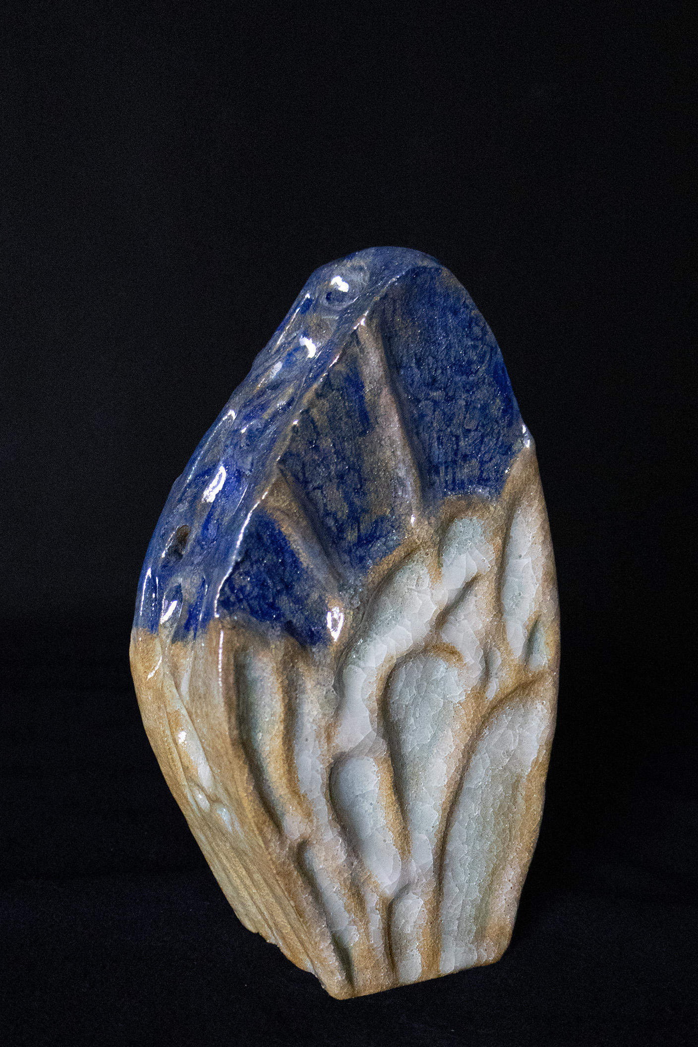
Art Portfolio 1 classes started in January 2024. From the very beginning, we stimulated our creativity through games such as: reproducing famous painting works in a group of two, using things available in the class Also, exercises like "Crazy Eight" pleasantly stimulated my imagination, helping me evolve my ideas. The next step was to choose a theme from the three available: primitivism, pop art and industrial. I decided to make the main project with AP1 based on the theme of primitivism. The next step was to choose a theme from the three available: primitivism, pop art and industrial. I decided to make the main project with AP1 based on the theme of primitivism. I started doing research on the ceramic material, the tools used during the process and the artists I was inspired by, like Gareth Mason, Nigel Hoyle and George Bowes. Then, during class, we started working on sketches. During this process, I decided to use the Impressionist and Post-Impressionist eras as colour inspiration. Having an outline of the project, I decided to use the ceramic workshop available at DMU, thanks to which I could move on to the stage of creating 3D works. 

During this semester, I learned how to be more organized. Due to the material I chose, ceramics, and the process it has to go through from the mass to the finished product, all the firing processes, which take a lot of time, my time management has improved. The opportunities that were presented to us during the workshop introductions showed me many possibilities that I hope to use and improve in the next term. 

This module was interesting for many reasons. First of all, it showed me the possibilities offered by studying at DMU, the number of workshops, their diversity and the large range of equipment that we can use are very promising. Also, the technicians were very helpful. 

I feel grateful for this term, especially for the workshops and their possibilities. Also, knowledge transferred during classes, and opportunities to improve my creative thinking, especially in my progression route - Design Crafts. These nine weeks have shown me how much I can do. Also, artist research allowed me to look at it from a different perspective. The works of artists from the past and present gave me a lot of understanding of the process. I feel that thanks to these classes I am better prepared for the challenges at DMU. I now know much more about the process of preparing my own project, from scratch to making it physically. These are definitely useful skills for my future, as a student and also as a craft designer.

Website: Last Changes

 The final changes to my website were mainly related to the portfolio part. Specifically, the changes included: adding a description to the photos, changing the project profile photo and adding an introduction.  


I also decided to add a separate gallery in the gallery for all boards, including my 2D sketches. This way the gallery looks more clear. 


Unfortunately, I don't know how to change the white background in the photo description, so I would like to improve it for the next term. For a moment I also thought about adding more photos to the gallery, but I decided not to overdo the style and content and keep it simple and clear.

Sunday 10 March 2024

Website: Creating the Portfolio

 I started working on the portfolio by selecting photos that I had the opportunity to take in a photo studio in one of the DMUIC buildings. The studio allowed me to take professional photos. I use a table where I spread black material as a base for my ceramic sculptures. I chose black as the background to match the ground. Unfortunately, many of them turned out too dark or blurry. Fortunately, I could choose 6 final versions of my 3D ceramic designs. 


The 2D final designs with descriptions of individual batches and explaining my colour inspiration, which I tried to keep to the end.


I also changed the background colour to a more delicate black (#101010). A more pleasant shade to the eye.


Saturday 9 March 2024

Converting 2D drawings into posters for website portfolio

 I chose a blue watercolour effect as the background. I think it fits the concept of my drawings. I downloaded the background from Unsplash, as it is a site that provides free, high-quality graphics. I chose Photoshop to create the selected background for my drawing. In the program, I changed the background fill to 75%. When applying the drawing to the background, I selected the Layers option and then Multiply to combine them. The next step will be to add a name and text describing the project.


I did exactly the same process for the second 2D drawing. Here, too, the name and description of the project are still missing.


At first, I wanted a simple blue transition effect as the background. However, I gave up this option because when applying a 2D drawing to the background, the transition from the drawing to the background was clearly visible.


Website updates


Using Photoshop, I changed the photo format from CR3 to JPG, so I could use the photo for the Home Page on my website. Most of the photos I took as examples for my portfolio turned out to be too dark for the portfolio. I decided that they were perfect as photos for the website. I like the way the product details are shown. 


The background on all subpages has also been changed, from white to black. I believe that this change adds a more interesting and professional look to the overall website. I replaced the text with a very light grey colour, the contrast between the text and the background gives a classic and clear look.


Update the portfolio. I used Photoshop and a photo taken in a photo studio, which I converted into the profile photo of the project "Blast From The Past". 


To brighten the objects in the photo I used a tool called "Dodge Tool". Then I pasted the logo in the lower right corner, just like in the profile picture of the original "Roots of the Jewellery" project, to maintain the consistency of the designs.  The font I chose, "Herculanum", visually matches the font of the logo.


Final boards


To create this board I use exactly the same background as for the ideal client. We wanted the entire project to harmonize with each other in terms of colours. The font I chose is also Ink Free Regular, just like in the previous board. 


The concert of my project "Blast From The Past" was posted on this board. I placed one of my 2D works on it, which represents my design ideas and logo. I used Photoshop to make this board. 


A table with a description of the ideal customer based on target audience research.


Friday 8 March 2024

Ideal Persona User

I started working on the Ideal Client for my project "Blast From The Past" by looking for a background. I use the Unsplash website to find graphics that serve as a background. I decided to look for graphics that would be associated with primitivism. 


Then, using Photoshop, I started creating the board. I change the fill to 50% due to the visibility of the text. I used Ink Free Regular as the font. 


My ideal client is a person aged 32 and over. The chart showed that in the UK the age at which people decide to buy their first home starts at 32 (statista.com). My research also shows that the gender that more often buys home decorations is women. That's why I decided my ideal client would be a woman aged 32. As my ceramic project is a handmade product, I believe that it will be better received by a group of people who appreciate this type of work, more than cheap mass production. Also, the fact of the reference to nature through the insect motif included, I think that people who feel a connection with nature will be better customers.


Reference: 

Statista Research Departamen (2024). British first time home buyers: average age in 2011-2021. [online] Statista. Available at: https://www.statista.com/statistics/557901/first-time-home-buyers-average-age-united-kingdom/#:~:text=Since%202011%2C%20the%20average%20age [Accessed 26 Feb. 2024].

Saturday 2 March 2024

2D Works: Progress

I decided to make my first 2D work using watercolour.


For the second 2D plan, I use monoprint works as a background. To create this part I used oil paints and the Fine Print workshop. I also use special foam to make stamps. I cut out a wing pattern on it and then glued it to cardboard to create a stamp. Then I mixed blue and black oil paints to obtain a dark blue. Then, using stamps and paints, I stamped them on the previously created background.


I am considering one of these options as my final choice for the 2D plan.


This is a 2d version of my third work. I used watercolours and ink to create the background. I created several versions of my sketch, below is the final version that I chose for my portfolio. I chose shades of brown and blue. Then, using soft pastels in these colors, I filled the center of the vase and accessories.


Reflection: Art Portfolio 2

     In Art Portfolio 2, I learned techniques for developing ideas. The classes showed me how to evolve,  my ideas, and change and improve ...