To create this board I use exactly the same background as for the ideal client. We wanted the entire project to harmonize with each other in terms of colours. The font I chose is also Ink Free Regular, just like in the previous board.
Saturday, 9 March 2024
Friday, 8 March 2024
Ideal Persona User
I started working on the Ideal Client for my project "Blast From The Past" by looking for a background. I use the Unsplash website to find graphics that serve as a background. I decided to look for graphics that would be associated with primitivism.
Then, using Photoshop, I started creating the board. I change the fill to 50% due to the visibility of the text. I used Ink Free Regular as the font.
My ideal client is a person aged 32 and over. The chart showed that in the UK the age at which people decide to buy their first home starts at 32 (statista.com). My research also shows that the gender that more often buys home decorations is women. That's why I decided my ideal client would be a woman aged 32. As my ceramic project is a handmade product, I believe that it will be better received by a group of people who appreciate this type of work, more than cheap mass production. Also, the fact of the reference to nature through the insect motif included, I think that people who feel a connection with nature will be better customers.
Reference:
Statista Research Departamen (2024). British first time home buyers: average age in 2011-2021. [online] Statista. Available at: https://www.statista.com/statistics/557901/first-time-home-buyers-average-age-united-kingdom/#:~:text=Since%202011%2C%20the%20average%20age [Accessed 26 Feb. 2024].
Saturday, 2 March 2024
2D Works: Progress
I decided to make my first 2D work using watercolour.
For the second 2D plan, I use monoprint works as a background. To create this part I used oil paints and the Fine Print workshop. I also use special foam to make stamps. I cut out a wing pattern on it and then glued it to cardboard to create a stamp. Then I mixed blue and black oil paints to obtain a dark blue. Then, using stamps and paints, I stamped them on the previously created background.
This is a 2d version of my third work. I used watercolours and ink to create the background. I created several versions of my sketch, below is the final version that I chose for my portfolio. I chose shades of brown and blue. Then, using soft pastels in these colors, I filled the center of the vase and accessories.
Wednesday, 28 February 2024
Class Presentation
In week 7, we were tasked with making a short presentation in which we would present our progress at work and in the group so far. To better show my current progress and the inspirations I used when creating, I printed current photos of my works. Then I attached them all to the wall, along with drawings and printed paintings from the Impressionism and post-Impressionism period, which were also my color inspiration. The presentation wall also includes photos of insects and works by famous ceramic artists. It will make it much easier for me to convey information, and I think it also helped my friend visualize my projects. I also take into account mistakes (broken butterfly wings) and processes that significantly improved the appearance of my works, giving them a professional look (smoothing using a wet sponge).
Third Ceramic Project: Progression
The third, and last, work is also getting closer to the final result. After the first firing (called bisque), the vase took on a delicate greenish colour, while the vase that did not have the underglaze applied took on a delicate orange shade. The streaked effect gave the whole thing an expressive effect.
My next step was to highlight the texture. For this, I used orange oxide. Then, using a damp sponge, I wiped off the excess colour. Thanks to this process, recesses and reflections on the material were highlighted. The moth shape I obtained using ready-made stamps now looks like the old-simple image. The orange colour reminds me of the colour of caves, and the shapes of the insects look like primitive paintings. The whole thing took on a primitive look, which is satisfying because of the theme I chose - primitivism.
Second Ceramic Project: Progression
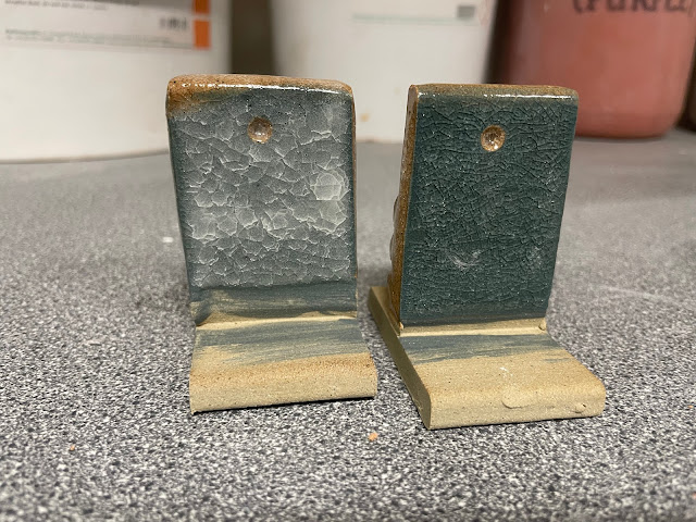
My second project at the burnout stage in the kilt took on a distinct blue colour. As it turned out, not all parts had been painted thoroughly, and in some places, there were visible spots of the raw colour of the ceramic mass (a shade of beige colour). This time I used clear glaze for glazing.
First Ceramic Project: Progression
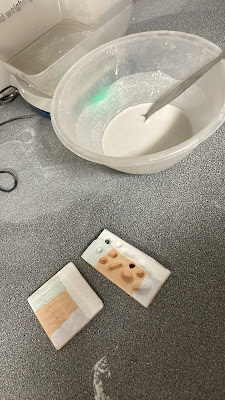
This part taught me what the process of preparing glaze looks like. It is not, as I thought, a ready-made mixture. This process requires accurate measurement of ingredients.
Subscribe to:
Posts (Atom)
Reflection: Art Portfolio 2
In Art Portfolio 2, I learned techniques for developing ideas. The classes showed me how to evolve, my ideas, and change and improve ...
-
I stared creating the logo in Canva. From the available templates , I choose the one that would best suit my ethnic jewellery project- Roots...
-
April Vollmer is a New York artist. She studies the mokuhanga technique and Japanese woodcut printmaking after receiving her Master of...
-
I took advantage of the opportunity to have access to the ceramics studio at DMU and started working on my ceramic project. First, for the p...
%20copy.jpg)


