Thursday, 11 January 2024

Initial Ideas generation (Crazy Eights)

To briefly explain the rules of Crazy Eights:

We divided the sheet of paper into eight parts. We had to draw a creative idea for each of them, no matter how absurd they might seem. We had two minutes for each idea. Our ideas consist of places, colors, shapes, and materials that inspire us. An interesting way to draw out ideas at some point that might be criticized or even rejected, with more time to analyze them. With only 2 minutes, our minds didn't have time for it. Through this form of entertainment, we were forced to think creatively.


During eight two-minute rounds, ideas such as floral patterns, a set of ceramic dishes, a meadow motif, an insect motif, jewelry with insect motifs, and strange shapes of vessels were created in my head. Ideas such as meadows, floral and insect motifs, various shapes of vases, vessels, and jewelry motifs appeared in my head.


I chose the meadow motif as the main one for my further search for inspiration. This led to ideas such as:

Vases with floral motifs that are reflected on the ceramic mass or glued to it, create a more 3D effect.
Jewelry in which eared flowers would be immersed in various organic forms.
The motif of the wing of a flying insect, for example, a dragonfly, is the main shape motif.
Bearings whose main shape is the wing of a dragonfly 
An irregularly shaped stick with macrame flowers and weaves depicting a tree combined with a meadow motif.
A decoration for a children's room, a circle on which decorations with motifs such as bees, flowers, and pompoms in the colors of nature would be hung.
Necklaces with leaf motifs and weaves imitating interconnected roots. Brown, beige, and shades of green colors.

Some ideas were immediately rejected by me, but some of them I find quite interesting. As I continue to research and look more closely at each of them, I think I will find what I am looking for. Even if I don't use all of them, I hope that at least some parts of them will be useful in the main project.

Wednesday, 10 January 2024

First Thoughts on the Project Themes


My first feelings about the three presented therms: primitivism, Pop Art, and Industrial. Primitivism appeals to me the most because of its strong bond with nature, and the symbolism of symbols and patterns. An interesting solution could be to combine Tim Burton's gothic style or Japanese culture with ceramics materials.

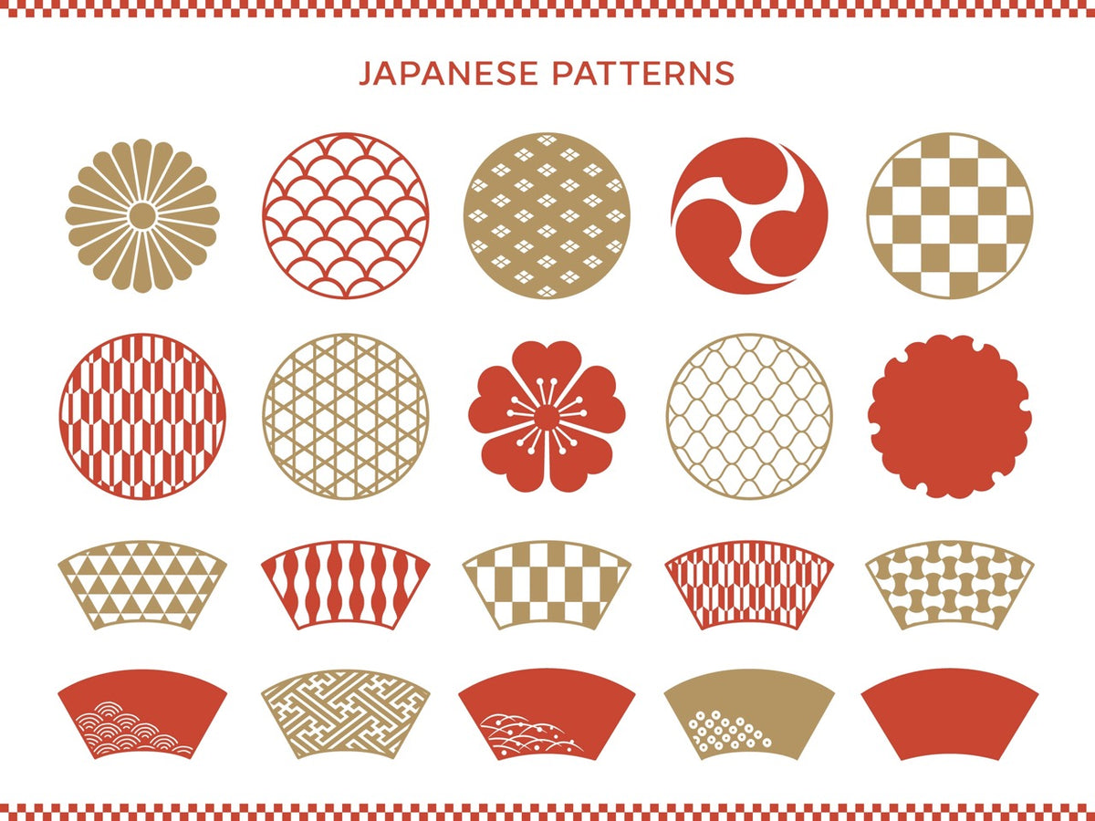
When it comes to Japanese patterns, I was thinking about creating a ceramic project based on Japanese culture. Using traditional Japanese patterns, create something similar to the pottery created in the Yayoi period. This was the stage in which people with a nomadic lifestyle began to settle in one place.  There has been an increased interest in ceramic products for everyday use.
I thought this combination might be interesting. To create this project, I was thinking about using a 3D printer to create patterns and cutters/rollers that could be used in combination with ceramics. 

I think it will be a good idea to expand knowledge about Japanese history, their methods of creating handicrafts, and national patterns. 


I'm also thinking about combining T. Burton's gothic style with therms pop art. Creating a pattern that could be used as part of a larger project.  Maybe use dark colors with cartoonish, exaggerated proportions of the characters. 


I found such color palettes for the Gothic style. You can notice that dark colors predominate in them. Dark shades of purple, blue, and red. Then more delicate shades of pink, beige, and gray.


This is what my first ideas look like. However, I don't want to stick only to what first came to my mind. Some of them will definitely stay with me until the final project. However, I am sure that some of them will change as I deepen my knowledge on this subject.


References:

Romano, A. (2019) Tim Burton has built his career around an iconic visual aesthetic. here’s how it evolved.Vox. Available at: https://www.vox.com/culture/2019/4/17/18285309/tim-burton-films-visual-style-aesthetic-disney-explained (Accessed: 11 January 2024). 

The Spaceshipper (2021) Dune (2021): Space Guild Costume Design, art by Keith Christensencostume designer Jacqueline West: ‘it’s all quite ecclesiastic. I looked to a lot of drawings and murals from the avignon papacy in the 1200s, but we made it look more ominous with those big dome headdresses...’ pic.twitter.com/kvduh0dreeTwitter. Available at: https://twitter.com/thespaceshipper/status/1457002336598040577 (Accessed: 11 January 2024).

Art, D. of A. (1AD) Yayoi culture (ca. 300 B.C.–300 A.D.): Essay: The Metropolitan Museum of Art: Heilbrunn timeline of art history, The Met’s Heilbrunn Timeline of Art History. Available at: https://www.metmuseum.org/toah/hd/yayo/hd_yayo.htm (Accessed: 11 January 2024).  

Goth colors color palette (no date) Color Hex Codes. Available at: https://www.color-hex.com/color-palette/62917 (Accessed: 11 January 2024). 


Ice Breaker Challenge/ Recreating an Artwork

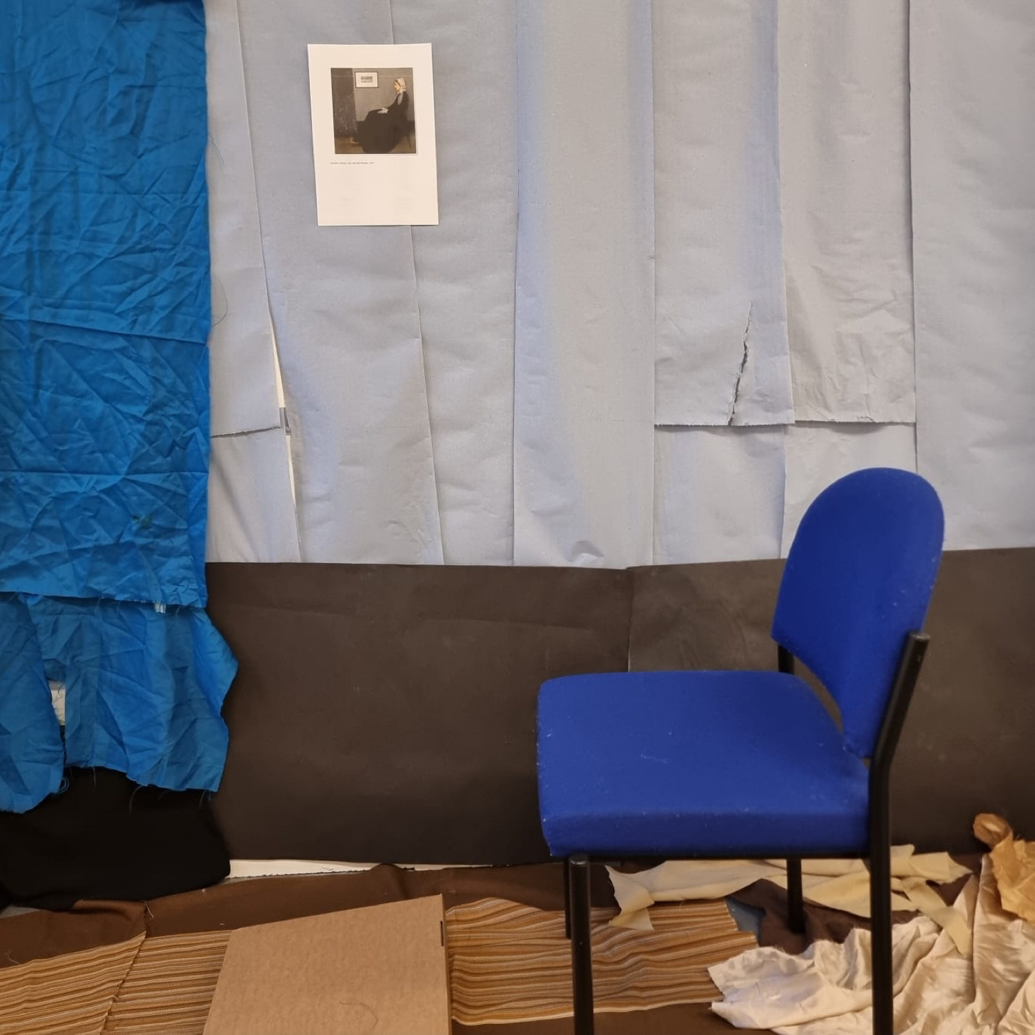
The first ice-breaking task was to get into groups of two and reproduce known artworks. Together with Piotr, we chose "Whistler's Mother" painting by James McNeill. We started the work by setting up the background. We chose a blue paper towel for the hands as the main material because of the similar colors. Then, in the box with materials, we found a black dress and scraps of blue material, which we decided to use as details. Black paper was used as the bottom of the background. Then we chose a chair as the foreground decorations and a cardboard box as a footstool.


The next step was to have professional make-up done by a local professional, that is me. We used acrylic farms as a color palette, which we mixed together until a satisfactory effect was achieved. Cosmetic version of IKEA.


As a costume, we used black leather material, a blonde wig, and two pieces of white lace, which we used as a head cover and accessories for the hands. 


I think we managed to keep it similar to the original through the colors and details such as the footstool and the painting on the wall. Also, the expression of the model - Piotr, was perfectly reproduced with the original.


 I consider it a success to choose our target image as a background element. a fun detail that captures the spirit of this assignment. Unfortunately, we missed one detail, or more precisely, the position of the head cover, which should be more to the side, but in our work, it is in front of the torso.


A few words about the artwork " Whistler's Mother" painting by James McNeill"
The original version of this artwork can be seen in Paris, at the Clark Art Institute in Williamstown with the Musée d'Orsay. Interestingly, it is the first American work that was bought by the French state and today it remains one of the most important American works outside the country. As for interesting facts from the life of the title character. Whistler's Mother, Anna Whistler, gave birth to five sons, but only William and James lived to adulthood. (Schieldahl, 2015)


References:

Schjeldahl, P. (2015) Why is ‘Whistler’s mother’ so iconic?The New Yorker. Available at: https://www.newyorker.com/magazine/2015/08/31/moms-home (Accessed: 11 January 2024). 


Monday, 8 January 2024

Welcome to Art Portfolio


Welcome back after a Christmas break! 


Quick reminder: my name is Aleksandra and this semester I will continue this blog on the subject - Art Portfolio. My goal is to study Crafts Design in the next academic year.  

During the break, I spend most of my time resting and gaining strength for new artistic challenges. Among more ambitious activities I borrowed a few books about ceramics, like a book of Pablo Picasso's ceramic works - "Picasso and ceramics" by Hazan, from the DMU library. Also during my visit to Poland, my family and I went to Karpacz. Cities with a beautiful architectural church - Vang Stave Church. 

That’s my photograph of Vang Stave Church 

I also try to draw the Vang Stave Church in my free time. And one more picture of the building that I found on Pinterest. In the future, I want to finish them with the watercolour technique. 


While resting, I managed to catch up on watching the new movie adaptation of the epic science fiction novel Dune written by Frank Herbert. Costume design: Jacqueline West and Bob Morgan did a really great job. The costumes in this adaptation are just amazing.


"Well, as I mentioned, I based all of the Atreides armor on the Templars, so this idea came up in conversation with Denis very early on about how the Catholic Church condemned the Templars, so I thought perhaps the Spacing Guild should be quite ecclesiastic. I thought it was a good symbol — with the ruling body going after House Atreides, just like the king and the church went after the Templars for the most arbitrary reasons." (West, 2021)

No photo description available.

The Space Guild costumes from "Dune" movie


References: 

Brzeski, P. (2021) ‘dune’ costume designer shares symbolic inspirations for epic’s visionary stylesThe Hollywood Reporter. Available at: https://www.hollywoodreporter.com/movies/movie-features/dune-costume-designer-jacqueline-west-interview-1235041394/ (Accessed: 11 January 2024).

The Spaceshipper (2021) Dune (2021): Space Guild Costume Design, art by Keith Christensencostume designer Jacqueline West: ‘it’s all quite ecclesiastic. I looked to a lot of drawings and murals from the avignon papacy in the 1200s, but we made it look more ominous with those big dome headdresses...’ pic.twitter.com/kvduh0dree, Twitter. Available at: https://twitter.com/thespaceshipper/status/1457002336598040577 (Accessed: 11 January 2024).  

Monday, 4 December 2023

Reflection


 During this semester, my project was to create jewelry designs inspired by the ethnicity of Native Americans. While creating this project, I learned a lot about programs such as Photoshop and Illustrator. Starting from the beginning, I created a poster using basic internet programs. Where I used ready-made templates to create a poster for Pink October.My first attempt to create a logo using Canva. It all seems so far away that it's amazing how much you can learn in such a short time. It shows how developing these classes were for me. Getting to know programs like Photoshop and Illustrator, which are more advanced I was surprised that knowing the basics of these programs provided so many options. How easily and quickly you can turn a drawing into a relatively (I only learned the basics) professional-looking poster. I want to get to know these programs better and hope to have the opportunity. 


The website also was a challenge and something new. Despite the struggles, I think it was an exciting and educational experience. This showed me how important the font and the choice of background colors are. This showed, how important are these choices in the overall reception of the website. Things that are so obvious that I didn't think about until I had to create them myself. Writing the "about myself" section was an interesting experience for me. I had to find self-confidence as a creator. I had to separate my private world and remind myself what it was like to fight for my dreams. 


To summarize, I learned a lot during this semester. To summarize, I learned a lot this semester. I realized that I had to fight for what was important. The more difficult it seems, the greater the satisfaction at the end when you did your best. I also learned the basics in programs that, not so long ago, were something very complicated for me, even in my imagination. I learned a lot about them, as well as about myself.


A very interesting beginning and I look forward to its further development.


Website Feedback and UX Testing

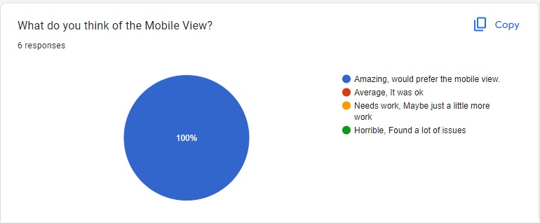
 The task during the class was to provide feedback for websites created by classmates. This task was supposed to show us the strengths and weaknesses of our work on the website. I received only positive feedback in response to all my questions. Which is very nice, but unfortunately it does not show me any direction for development and improvement. Luckily, I am my own worst critic. I do not think that the website I created (and it is worth mentioning that this is the first project of this type in my life) was so perfect that nothing could be improved. Still, it's a nice feeling that others might like it.


Friday, 1 December 2023

The website: changing "about me" section


Today my task was to improve the about me section on my website. I think that the current description shows me in a more confident way as a person and clearly expresses my goals for the future.


I also made some changes in my portfolio section, because I had a lot of spelling mistakes in my posters.  To do this, I used a program called Grammarly to make sure that my posters would now be linguistically correct.

Reflection: Art Portfolio 2

     In Art Portfolio 2, I learned techniques for developing ideas. The classes showed me how to evolve,  my ideas, and change and improve ...