Thursday 30 May 2024

Boards: Concept & Ideal User Persona

I'm currently at the stage where I'm beginning to work on the boards, about the concept, target market, and materials. To start off, I found a background on the Unsplash website. I chose this website because it offers a wide selection of legally available images to download. 


I searched for an orange background, but unfortunately, the ones that suited my designs weren't free. So, I decided to use a yellow background instead. Since yellow is close to orange on the colour wheel, I believe it will complement my designs well.  Next, I used Illustrator to begin working on my boards. Firstly, I adjusted the opacity to approximately 60% to ensure that my text would be clear and visible. 


    Then, I added my text to the prepared board and started searching for a font. I decided to use the Athelas font.

    The final boards.  
I've finished two out of three boards for now. I'll continue with the boards about materials soon. Additionally, I decided to rotate the image back 90 degrees on the concept board. This change makes the text look better and also fits better with the second one.

This board was made using the information provided by our teachers at the start of the term. I combined this with the theme I chose: fire as a symbol of new beginnings.


I made this board using the details I got from researching the target market.


Tuesday 28 May 2024

Website: Portfolio


    I started updating my website by preparing the cover page for my next portfolio. Using Photoshop, I added my logo, "The Galgankowo," to the bottom part of the image. 


    Next, I started changing the colour of the name and adjusted the button colours on the website page to make them more visible. In the last update, I tried making them invisible to avoid confusion about why there were three portfolio sections, one of which was empty.


    However, it seemed a bit overwhelming, as the logo was barely visible against the background. To improve this, I decided to remove all the black marks from the background to create a clearer space where I could add the name of the collection, my name, and other details. I used the spot-healing brush tool for this process.


    For the final part, I added all the 2D outcomes that were ready to the portfolio. This time, I decided not to remove the black marks from the background. Instead, I chose to include all descriptions not directly on the images, but in the description part. This way keeps the pictures whole while giving lots of details in the descriptions beside them. Another option is to create small fields of different shades on the existing 2D images.


Make-up bag & Apron outcomes

    I started my makeup case/small case project by adjusting the length of the zipper. I needed a 40 cm zipper, but the only available option in orange was 45 cm, so I cut the zipper down to the right length. After cutting the zipper, I covered the raw ends with small pieces of fabric, sewing them onto both ends to secure it and give it a neat finish.

    Next, I prepared the main fabric pieces for the body of the case. To make the case thicker and more stable, I ironed interfacing fabric onto the back of the main fabric pieces. This made them stronger and more stable. 


    After that, I sewed the zipper to the main fabric pieces using a straight stitch. I used small pieces of fabric to cover the beginning and end of the zipper and give it a neater finish. These fabric pieces helped ensure a clean and professional look when sewing the sides together. 

    The final result is acceptable, but if I were to make this design again, I would definitely change how I sew the fabric to the zipper. I would fold the fabric before sewing it to create smoother and more professional-looking edges. I really like how the orange zipper adds a bright and cheerful touch to the case.


    I didn't take many photos during the apron sewing process, but it was definitely the quickest and easiest project of these designs. After cutting the material from the pattern (as shown in a previous post), I added a lino print pattern to one of the pockets. Then, I decided to incorporate some orange into the design. I found a few pieces of dyed cotton material from a previous dyeing workshop that matched a similar orange tone, so I cut it to size for the second pocket. To make it stronger and more durable, I ironed the interfacing fabric onto the back.

    First, I sewed all the sides of the apron to make the edges look more professional and prevent the material from tearing. Then, I prepared the pocket using the same process.

    I decided to sew one pocket slightly overlapping the other to add more visual interest. Then, I marked the spot on my apron where I wanted to sew it. I used a disappearing marker for this step.

I started sewing the pockets by attaching the grey side to the orange one. I did this first to avoid accidentally sewing the lower pocket if I started sewing them directly onto the front of the apron. Once this step was done, I proceeded to sew them directly onto the apron. I started with the orange pocket because if I had begun with the grey one, I would have covered one side of the orange pocket, making it impossible to sew it on. 
    

    To finish the apron, I simply sewed the arm apron together. While the final look isn't bad, it could definitely be improved. The sewing on the sides of the apron could have been done more precisely, especially around the rounded parts. The pockets also don't look very professional, but considering it was my first time, they're not that bad. However, I believe adding the orange pocket to the design was a very good idea; it added uniqueness and connected it with the rest of the projects.

    If I were to make it again, I would definitely experiment more with the pockets, perhaps by changing their sizes: making one bigger or smaller. I might also consider sewing vertical seams into the pattern to create small sections, for example, to hold a spoon or a brush. These adjustments could add functionality and further upgrade the design.


    The entire collection, including the tote bag, apron, and small case, has a consistent look that ties them together. You can easily see that they belong to the same collection, as they share similar design elements and colour schemes.

Wednesday 22 May 2024

Fine Art Print Workshop & Sewing Workshop: Tote Bag


    I used a sewing workshop to finish my 3D project, a tote bag. took with me the materials that I had cut out from the ready pattern and the lino print design, which I created using the linocut technique in the Fine Art Print Workshop (video bellow). 


    For the tote bag, I chose a cotton material with two colours: light beige with a pattern that connects with my design background, and light grey. As for the handles, I used a herringbone twill webbing tape sew strap, 38mm in orange tone, to match Anhelina's city logo.

    I started the sewing process by preparing the pocket. I decided to use double tape to secure the top of the pocket part. This tape replaced the need for seams, ensuring that my design remained intact without any visible stitching. 
    The next step involved sewing the bag arms to both sides of the bag. In this part, I also used double tape before sewing to secure it in the correct position and prevent the material from shifting during sewing. This was particularly helpful for me as a beginner. Additionally, I chose to use an orange sewing thread for sewing the arms part. 

 
    Then I prepared the top part of the sides of the bag. First, I used double tape for the initial fold (about 1 cm), and then I sewed the second fold using a straight stitch.
    I used an overlock machine to sew together the sides and bottom of the bag. Next, I sewed the bottom and sides together using a straight stitch and then also used the overlock machine to make it stronger.


    After I sewed both sides of the bag together, I realized that the handles weren't in the same position—they were off by about 0.5 cm. I decided to leave it as is because it doesn't affect the bag's functionality, just its appearance.


Final look:


    Overall, the tote bag turned out well, with a strong and durable structure, despite the handles being slightly off. Two really useful tools in this project were the disappearing purple marker and the pattern maker. The marker was great for marking the right position without leaving a trace after a few hours; it just vanished. The pattern maker tool helped me find the right position. I also believe that using orange for the arms of the bag gives it a unique and eye-catching finish plus, it's a perfect match to Ahelina's city logo, adding an extra layer of significance to the design. 

2D Final Results

    I decided to simplify my lino print to just one pattern because I believed it would be clearer, especially since I wasn't satisfied with how the orange leaf looked on the bird's bottom part. After cutting the new pattern from Lino, I decided to mix two colours - black for the bird and orange for the leaf - on one linoleum block. However, it comes out to be more difficult than I thought. The orange didn't turn out the way I wanted, and in trying to remove spare black ink from the leaf, I accidentally smudged some ink from the bird's head. Since I didn't have much time or skill to solve the problem, I just printed everything in black.
   I picked this pattern for my portfolio homepage and tote bag design. I also made smaller versions for a makeup bag and apron pocket by cutting them from the linoleum block.


    I tried to make my background better with watercolours, thinking of a fire-like style. But it seemed like there was too much going on back there. So, I decided to try again with lighter colours that still fit the fire theme.


    In the end, the second watercolour background seemed too light, so I decided to give it another shot using the Fine Art Print Workshop and the monoprint technique. This time, I experimented with adding more colours instead of just one. I used the roller differently to create irregular traces, giving it a more textured look.


The final 2D outcomes: 


    After experimenting with mixing ink colours, I realized it can be challenging, but I'm confident that with practice, I can improve the colour palette for my future designs. Printing is a slow process, requiring patience to ensure each step is done right. Rushing can lead to mistakes, so it's important to slow down and pay attention to every detail. I see mistakes as chances to grow and build up my skills for the future.

Monday 20 May 2024

The bowl part 2


Another approach to make a bowl involved working with pieces of wood connected with epoxy resin. Unfortunately, after three weeks of waiting, the bottom part of the bowl still hadn't dried. To proceed with my project, I needed to cut out the bottom part.

When I did this, I didn’t cut it straight. Since it was a mix of epoxy resin and wood, I couldn't use a sander for either material without damaging the other. I had to sand it manually with the largest sandpaper I could find ( see below the fig.1) the biggest piece of sandpaper was glued to a big wooden desk. This was the hardest part of all. I couldn't achieve a perfectly straight finish because I was running out of time, and my hand was in a lot of pain.
Fig.1, Future bowl on a big piece of sand paper

After deciding that the surface was as straight as I could achieve in that situation, I attached a part from a machine designed to shape pieces of wood into forms, such as bowls (the name of that type of machine is lathe). To do this, I drilled three holes using a drill and then used a screwdriver to secure the part from the machine to the bottom of my future bowl with screws.


    After setting up the bowl on the machine, the next step was to flatten its top surface. Some wooden bits were uneven, as the epoxy resin didn't cover them evenly. I used a sharp gouge tool to smooth out these bumps. 

    
    After reaching my goal, I used a special tool to carve out the middle of the wood. (You can see this in the video below.) 


    Then, I switched to a round-nose scraper tool to carve out the middle of the wood. This tool helps create the initial hollow shape, similar to a bowl. 

    The next step involves sanding to ensure a smooth surface both inside and outside of the bowl. Additionally, I'll use my personal grinder to focus on sanding the bottom of the bowl more thoroughly. I will cut out a round piece from the bottom to cover the screw marks. Later, I'll fill this spot with a piece of wood, where I'll use the pyrography technique to add Anhelina's city logo. 

    The most challenging part was levelling the bottom of the bowl after cutting. If I could do it again, I would definitely pay more attention to this step, as it ended up adding extra work for me. However, I'm pleased with how the epoxy resin-infused parts allow light to pass through, creating a transparent effect. The combination of resin and wood turned out to be a successful process. The addition of black resin on top of the bowl created an extra effect, looking like flames when combined with the orange tones of the epoxy resin.

Thursday 16 May 2024

Maerial Research

Epoxy Resin 

                                    Epoxy Resin for Crafts

    According to the producer, Craft Resin epoxy has little smell, is safe, and doesn't contain harmful chemicals. It's a food-grade resin for home and pro use that's safe for you and the environment when used correctly (World Wildlife Fund, 2024). I've mostly decided to use Craft Resin epoxy because it's a food-grade epoxy. Another reason I chose Craft Resin epoxy is because it's non-toxic and doesn't contain harmful chemicals like VOCs or solvents, making it more environmentally friendly. 


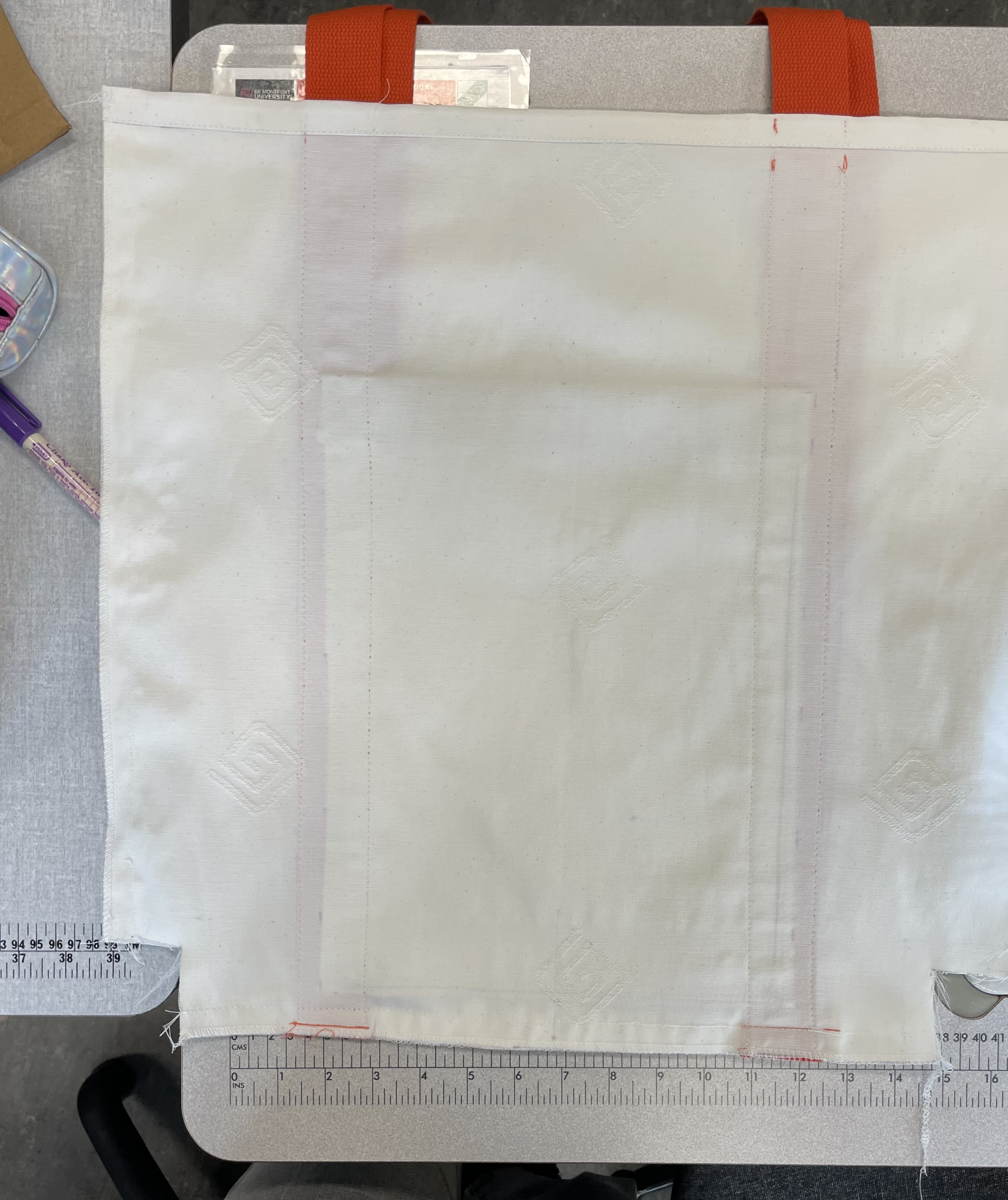
Cotton 

    Cotton is a natural material that comes from the cotton plant. First of all, cotton fabric is comfortable to wear because it feels natural on your skin, and its durability makes it a popular choice for clothing. Secondly, cotton is very strong, so it can resist mechanical and chemical wear and tear. Finally, cotton is also breathable. In the summer, it keeps you cool, and in the winter, it doesn't get too cold (House of U, n.d.). I don't make clothes, so I'm not too concerned with comfort and breathability. It's good to know, but what really matters to me is cotton's strength and its ability to resist mechanical and chemical wear and tear. This is crucial for my tote bag design, as I plan to make a large bag and need the material to be durable and resistant to tearing. Additionally, cotton is easy to clean and can absorb a lot of moisture. Despite being fairly rough, it is strong and sturdy due to its inner structure. Cotton can be easily painted, allowing for a variety of designs and colours (House of U, n.d.). An important aspect for me is that cotton can be easily painted, as I plan to use lino print and oil-based inks for my designs. Organic cotton is typically less harmful to the environment than conventional cotton, mainly because it is grown without the use of pesticides (Krosofsky, 2021). This is why I'm thinking about using organic cotton in my projects. According to WWF (2024), cotton is widely used around the world, but the way it's currently produced harms the environment. 


Leather PU
  
  I also considering using PU leather as a base for my small case. I found out that PU leather is sometimes seen as better for the environment than real leather because it doesn't use animal products. But it's made from plastic, which can harm the environment. I also learned that PU leather could be harmful if it has chemicals like phthalates, especially when breathed in. It's really important to choose high-quality PU leather that doesn't have any harmful chemicals (ChairOffice T/A Full Range Furniture Ltd, 2024).


Linoleum 
    
    Linoleum is great for printmaking because it's eco-friendly. It's made from natural stuff like linseed oil and pine resin, so it's biodegradable and doesn't have any harmful chemicals. When a design is carved into linoleum, lots of prints can be made from it. This results in less waste compared to other printing methods. Linocut printing doesn't need electricity, so it's energy efficient. Plus, the prints last a long time because they're made on good-quality paper (Qinuro, 2023). That is why, for those interested in art and seeking an eco-friendly option, linocut printing is a good choice. 


Oil-based inks 

    Oil-based inks are a popular choice for linocut printing. These inks consist of pigments suspended in oil, which allows for smooth application and vibrant colours. Unlike water-based inks, oil-based inks take longer to dry, which can be beneficial for specific printing techniques. AlsoOil-based inks stick well to different surfaces like paper and fabric, making them useful for various artistic projects. But it's important to remember that cleaning oil-based inks requires using mineral spirits or other solvents, which can harm the environment if not handled correctly (Mary, 2023). However, many artists choose oil-based inks for their rich colours, durability, and versatility in printmaking, aligning with the eco-friendly ethos of linocut printing.

Bees Wax

    I chose beeswax to finish my wood bowl. It's good for salad bowls, wooden spoons, and cutting boards, and it's safe for food. It's also great for children's toys because it's made from natural ingredients (Clapham's Beeswax Product Ltd, 2024). Beeswax highlights the wood's colours, so I decided to use it in my artwork.

Reference List:


House of U. (n.d.). Everything about cotton: the specifications of cotton fabric. [online] Available at: https://www.houseofu.com/en/blog/everything-about-cotton-the-specifications-of-cotton-fabric/ [Accessed 16 May 2024].

Krosofsky, A. (2021). Is Cotton Sustainable? [online] Green Matters. Available at: https://www.greenmatters.com/p/is-cotton-sustainable [Accessed 16 May 2024].

World Wildlife Fund (2024). Sustainable Agriculture Cotton. [online] Available at: https://www.worldwildlife.org/industries/cotton [Accessed 16 May 2024].

Craft Resin (2024). Craft Resin – 4L. [online] Available at: https://craft-resin.co.uk/ [Accessed 16 May 2024].

ChairOffice T/A Full Range Furniture Ltd. (2024). What is PU Leather? The Pros & Cons. [online] Available at: https://www.chairoffice.co.uk/blog/what-is-pu-leather/#:~:text=Sustainability [Accessed 30 May 2024].

Qinuro (2023). Why Linocuts are Environmentally Friendly. [online] Medium. Available at: https://medium.com/@qinuro/why-linocuts-are-environmentally-friendly-1c9492bb3f65#:~:text=Linocuts%20are%20not%20only%20an [Accessed 16 May 2024].

Mary (2023). The Great Printmaking Ink Debate - Mary Is Contrary. [online] Available at: https://maryiscontrary.com/the-great-printmaking-ink-debate/ [Accessed 16 May 2024].

Clapham's Beeswax Product Ltd (2024). Food-Safe Beeswax Salad Bowl Finish. [online] Clapham’s. Available at: https://claphams.com/product/beeswax-salad-bowl-finish [Accessed 16 May 2024].

Develop of 2D outcomes


    First, I use the Sketchbook application on my tablet to draw initial designs for a small makeup case and a tote bag. I try to sketch multiple concepts, exploring different shapes and features for both products ( can be seen in previous posts). After settling on a few solid ideas, I create more detailed drawings, focusing on proportions and key details.


    Then, I design and draw a small sign to be used as a background decoration (right picture). 


    Then, I experiment with different colour combinations. I apply these colour combinations to my designs in Sketchbook, creating mock-ups to preview the final product. I use a colour palette that reflects my fire team (orange and black) with natural cotton colours, which matches the materials I've already chosen for my designs. For the makeup case, I am also considering PU leather as a material.


    Next, using Photoshop, I start creating the final outcome. I add an American Robin with a White Oak leaf pattern to make the design more realistic and closer to the final look. I adjust the size of the pattern and place it in the correct position on the designs.


    For the last step in my digital design process, I use Illustrator to combine all the elements and also to create backgrounds for the final 2D outcome.


The final outcome for the tote bag and make-up case.

    
    In that step, the final move is transferring the design onto a linoleum block and cutting it. The next step will be to visit the final art print workshop and check how it looks after adding inks. 


    I really enjoyed developing the linocut technique. Although I cut my hand several times, I can see my progress and definitely want to continue with this technique even after finishing these projects. I love the unique vibe it brings to my 2D artworks. I can't wait to transfer these designs and see the final results.

    At this stage, it's hard to say what I would change. I think I'll be able to see what needs improvement once I see the results from both the linocut prints and the finished 3D outcomes. Maybe I need to add more detail or cut out something from the design, but I'll know that after I transfer my linocut to paper sheets/ materials.


Reflection: Art Portfolio 2

     In Art Portfolio 2, I learned techniques for developing ideas. The classes showed me how to evolve,  my ideas, and change and improve ...