Tuesday 30 April 2024

Devolopment of Idea: Pencils Case

    At this stage, I've experimented with different designs for pencil cases, using a previously created pattern inspired by the American robin, and explored various colour variants to enhance its visual appeal. Considering canvas cotton as the material for the pencil case not only prioritizes environmental friendliness but also ensures coherence with my other designs such as tote bags and aprons.

    The first design assumes pens will be inserted from the top, while also offering the option of closure with a lock shaped like a white oak leaf. The light grey, orange, and green colours work well together, creating a balanced and lively look. The grey acts as a calm background, letting the orange and green stand out with their bright and energetic feel.
    In the second project, objects like pencils are stored in compartments made just for them. The colour scheme is like the first design, with light grey and orange, and now black is added in too, giving it a sharper contrast. The design involves folding the project in half and securing it with a string.
    The last project takes inspiration from an envelope's design. It showcases a warm colour palette including yellow, orange, and red, which are neighbouring shades on the colour wheel, known as analogous colours. To secure it, an elastic band and button closure are incorporated. The pattern features motifs of the American Robin and a leaf reminiscent of the White Oak tree.

Wednesday 24 April 2024

Development of ideas: Apron

To start developing my apron design, I drew the outline of a woman's body. I chose to depict a woman because research shows (target market blog post)  that 81% of customers in the souvenir market are women. I used a Sketchbook app to draw the outline of the body. 


In my project, I want to emphasize simple and practical design for my aprons. I aim for them to be useful in everyday tasks like cooking or for artistic activities. I'm considering adding pockets that can store small items, depending on the purpose. For artistic use, I'm thinking about including compartments in the pockets to hold narrow tools like brushes or cutting tools. 
The materials used in the production of aprons will prioritize environmental friendliness. In today's fast fashion era, there's a growing popularity of organic cotton due to its sustainability. As a biodegradable natural fabric, conventional cotton is indeed more eco-friendly than synthetic fibres. However, organic cotton fabric takes sustainability a step further. Organically grown and processed cotton reduces landfill waste and pollution (Parachute Home, n.d.).


Reference List:
1)  www.parachutehome.com. (n.d.). What is Organic Cotton? Sustainable Cotton Fabric Guide | Parachute Blog. [online] Available at: https://www.parachutehome.com/blog/what-is-organic-cotton-and-sustainable-cotton# [Accessed 28 Apr. 2024].

Monday 22 April 2024

Development of ideas: and Linocut

I used the Sketchbook app to draft two prototypes inspired by the American robin. My concept aimed to blend the bird with motifs from the white oak tree. During the creative process, I made the choice to separate the bird from the white oak leaves. This decision was driven by the desire to maximize my options in the linocut printing process.

After completing my bird and leaf designs, I headed to the Fine Print Workshop. There, the technicians gave me a step-by-step introduction. First, I used tracing paper to trace my image. Then, I used carbon paper to transfer the image onto the linoleum. After that, I began cutting my design into the linoleum surface.  When cutting, I had to remember that it flips horizontally, also I had to cut out the parts I didn't want to be coloured in my design.


Once I finished cutting the linoleum, it was time to select colours for my design. For my initial attempt, I opted for green for the leaf and orange for the bird. However, I realized that the darker green overshadowed the bird. To solve this problem, I decided to make the leaf orange instead. This not only created a clearer contrast but also symbolized the vibrant colors of an American robin and the fire.


Next, I proceeded to transfer my design onto a cotton material to test the compatibility of oil paint with the fabric. After completing the transfer, I washed the fabric at 30 and 40 degrees Celsius. To my satisfaction, both options give satisfactory results, with no noticeable changes to the images or colours.

Given this outcome, I made the decision to include a notation on the tags, recommending washing at 30 degrees Celsius. Reason- environmental friendliness, as lower temperatures require less energy and are gentler on the fabric. 


Tuesday 16 April 2024

Colours inspiration board

This is what my colour inspirations board looks like. I mainly use elements of nature that are associated with Cromwell.

To create the drawings, I used a digital app - Sketchbook. Then I transferred them to the Illustrator and arranged them on a piece of paper in a combination that I considered clear. In the next step, I used the Elipse Tool and created circles that I filled with the colours from the drawing.


The last stage was to transfer the finished graphics to Photoshop. I used a graphic I found on Unsplash as the background. Then I created another Layer with graphics from Illustrator. Finally, I added captions to each drawing to make the entire graphic more obvious for someone who had no idea what elements from the natural world were associated with Cromwell/New Cromwell. 


I've decided to use orange and grey in my designs, inspired by the American robin. Also, the fiery orange will be the background motif for all my work. I want to make art about how a fire that destroyed a city led to it becoming stronger afterwards, without forgetting its past.


Saturday 13 April 2024

Initial Research: Grayson Perry


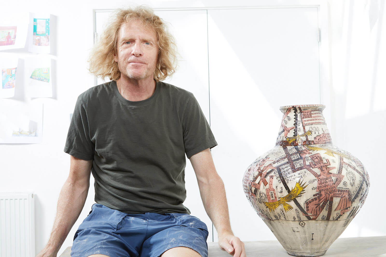
Grayson Perry, a British contemporary artist born in 1960, shares a deeply personal connection with his iconic teddy bear, Alan Measles, who has inspired many of his works. In 2003, Perry made history by winning the Turner Prize, embracing his identity as a transvestite potter in his acceptance speech. Perry's work delves into themes of masculinity, sexuality, class, religion, war, and the art world, created with a personal touch and the belief that art should show the artist's vision instead of trying to please everyone.He embraces mistakes as integral to his artistic process, crafting his unique style.
“I’m a quality control freak. I have to do it badly in the right way. I need to be able to make mistakes. I can't trust anybody else to make the right sort of mistakes, because mistakes is your style” (Perry in Bloomberg Originals, 2015).


The linocuts titled "Mr and Mrs Perry" were created by Perry in response to old Victorian portraits. Perry wanted them to have a simple, casual feel rather than being too complicated. He printed them on various papers, many with textured patterns like flocking or foil, and with edges that were roughly torn or unevenly cut. Perry openly admits that they don't look much like the people they're supposed to represent. Instead, he aimed for a handmade, expressive look. The pairs of linocuts are made from two different pieces of paper, highlighting the unplanned and spontaneous nature of the artwork. They were printed in the artist's studio by Eric Great-Rex (Paragon, n.d.). The black and white colours create a mysterious and vintage atmosphere in this artwork. The simplicity of those portraits is something I appreciate. I don't intend to limit myself to using only black in my projects, but I will try to make my work in that kind of simplicity.


"Selfie with Political Causes" is a special set of 68 etchings by Perry, with his unique style of bright colours and a simple perspective. In the selfie, Perry appears as his alter-ego Clare, dressed up with makeup and hair, riding a Harley Davidson motorcycle with words like 'Social Justice' and 'Equality' on it. The artwork talks about issues like racism and poverty. The motorcycle releases symbols of democracy and tolerance while opposing homophobia and tax evasion. It's Perry's way of reacting to politics becoming trendy in art (Enter Gallery, n.d.). Mixing primary colours such as yellow and red with secondary colours like green in the foreground creates a vibrant palette in the artwork. In the background, the use of baby pink and blue creates a calming and peaceful atmosphere. These bold colours make the artwork eye-catching and impossible to ignore. In my work, I want to achieve a similar effect of layers of colors overlapping each other. However, I won't use as many colors. Instead, I'll focus on using different shades of just one or two colors to create depth.

Reference List:

1) Wrathall, C. (2020). Grayson Perry: The MOST Specialest Relationship. [online] The Design Edit. Available at: https://thedesignedit.com/exhibitions/grayson-perry-the-most-specialest-relationship/ [Accessed 28 Apr. 2024].

2) Bloomberg Originals (2015), Brilliant Ideas: Artist Grayson Perry, [YouTube Video], Available from: https://www.youtube.com/watch?v=PI2JG67b-fs, (Accessed: 028/04/2024)

3) Paragon. (n.d.). Mr and Mrs Perry. [online] Available at: https://paragonpress.co.uk/works/mr-and-mrs-perry [Accessed 28 Apr. 2024].

4) Enter Gallery. (n.d.). Selfie With Political Causes. [online] Available at: https://entergallery.com/products/selfie-with-political-causes-ar20347#:~:text= [Accessed 28 Apr. 2024].

Images:
Fig1) Perry, G. (2006). Mr and Mrs Perry, G.Perry. Available at: https://paragonpress.co.uk
Fig2) Perry, G. (2018). Selfie with Political Causes. Available at: https://www.entergallery.com

Thursday 11 April 2024

Developmentof Ideas with visual reaserch


    As part of my developing of ideas, I focused on a part of the motif that I intend to transform into a pattern and make it using the linocut method. Then I will place it on selected parts of my projects, or all of them. This part is still in process, it will probably come out later. I decided to focus on the white oak tree, American Robin and Mountain Laurel motifs. I tried to combine them in various ways, the results of which are presented below.


Then I transferred the simple sketches to Illustrator, where I could make more colour options. Using ready-made graphics, I recreated the sketches, trying to keep them as simple as possible. I then transferred the simple sketches to Illustrator, where I could make more colour options. Using ready-made graphics, I recreated the sketches, trying to keep them as simple as possible.


Then I turned them into black-and-white versions. I wanted to see what they would look like in monochrome. I wanted to have visual options in case I didn't have enough time or the process of using multiple colours turned out to be too difficult for me.


Sunday 7 April 2024

Improving Digital Skills: Tablet Drawing

 Using a drawing tablet and an application called Sketchbook, I created the first outlines of the Tote Bag idea. Thanks to the simplicity of the program, I was able to compare different color versions. My next step will be to create simple patterns that I can use to embellish the fabric. 


These are the first ideas that I will improve and change. Thanks to the possibility of application, I definitely saved time when playing with colours. The front pocket included in the design was created as the part where the pattern will be placed. The colour inspirations were animals and nature: White Oak Tree, Mountain Laurel, American Robin and Sperm Whale. It was interesting and fun to try to combine colours, but I think I will use more neutral, delicate colours and patterns to reflect the spirit of the city. I will definitely do some research on this subject. 

Reflection: Art Portfolio 2

     In Art Portfolio 2, I learned techniques for developing ideas. The classes showed me how to evolve,  my ideas, and change and improve ...