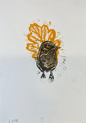
I used the Sketchbook app to draft two prototypes inspired by the American robin. My concept aimed to blend the bird with motifs from the white oak tree. During the creative process, I made the choice to separate the bird from the white oak leaves. This decision was driven by the desire to maximize my options in the linocut printing process.
After completing my bird and leaf designs, I headed to the Fine Print Workshop. There, the technicians gave me a step-by-step introduction. First, I used tracing paper to trace my image. Then, I used carbon paper to transfer the image onto the linoleum. After that, I began cutting my design into the linoleum surface. When cutting, I had to remember that it flips horizontally, also I had to cut out the parts I didn't want to be coloured in my design.
Once I finished cutting the linoleum, it was time to select colours for my design. For my initial attempt, I opted for green for the leaf and orange for the bird. However, I realized that the darker green overshadowed the bird. To solve this problem, I decided to make the leaf orange instead. This not only created a clearer contrast but also symbolized the vibrant colors of an American robin and the fire.
Next, I proceeded to transfer my design onto a cotton material to test the compatibility of oil paint with the fabric. After completing the transfer, I washed the fabric at 30 and 40 degrees Celsius. To my satisfaction, both options give satisfactory results, with no noticeable changes to the images or colours.
Given this outcome, I made the decision to include a notation on the tags, recommending washing at 30 degrees Celsius. Reason- environmental friendliness, as lower temperatures require less energy and are gentler on the fabric.


No comments:
Post a Comment