During this semester, I benefited from the expertise of technicians and attended various workshops, including the Fine Art Print workshop. Here, I learned the fundamentals and materials required for linocut creation. This allowed me to try out oil-based paints on both my 2D pieces and the materials I used for 3D projects. In the Sewing Workshop, I was introduced to sewing basics, such as using an overlocker, and learned about essential tools like disappearing markers and double-sided tape for fabrics. In the wood workshop, I got to use woodworking machines like the lathe machine and learned to use special craving tools, which helped me craft a bowl for the project. In the sculpture workshop, I experimented with mixing a resin solution, which I then combined with wood material.
Tuesday, 4 June 2024
Reflection: Art Portfolio 2
In Art Portfolio 2, I learned techniques for developing ideas. The classes showed me how to evolve, my ideas, and change and improve my concepts. This semester's focus was on rebuilding Cromwell, a town devastated by fire, both physically and spiritually. My assignment was to create objects reflecting the city's history and integrate them with a city's logo designed by a graphic designer.
To create my collection, I chose to explore a technique I recently learned: linocut. It seemed like a great opportunity to deepen my understanding of this method. Learning about artists who specialize in linocut was particularly inspiring and informative for me. Artists like April Vollmer, Grayson Perry, Angela Harding, and Angie Lewin were significant inspirations for my project. Their work greatly influenced my artistic perspective and helped me develop my own creative vision.
Throughout this semester, I had the chance to improve my time management skills and understand a wider perspective on the creation process. From developing a pattern to translating it into design and execution, I learned step by step. I also learned about the importance of researching materials and became aware of how many materials and textiles can harm the environment. Additionally, I gained an understanding of the value that durability brings.
I believe this semester has significantly improved my knowledge and skills. I now feel much more ready and confident to begin my journey in Design Crafts. Also, now I feel more confident in expressing myself artistically and have developed better skills to understand and communicate my ideas through art.
Portfolio: last changes
In the portfolio section, I made recent changes by removing the black marks from the orange 2D outcomes background, similar to what I did with the cover photo. I used Photoshop for this task. This adjustment improved the transparency of the 2D outcomes, allowing me to add text directly onto the image instead of in the description field. I believe this change enhances the overall presentation.


Website: Last Changes
I made the final adjustments to the website, particularly focusing on redesigning the gallery and adding names for each item in the collection, inspired by the city or its history, to deepen their connection with the local heritage. I also decided to switch the name colours from grey to orange to better match the collection's colour palette and create a stronger connection between the names and the overall look.


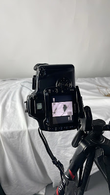
Website: Photos for portfolio
I used a photographic studio to take professional-quality photos of my designs. I set up the table carefully, matching the materials with the background colour. For that process, I used my old Canon D400 camera, as I prefer the photos from a digital camera over those from a mobile phone. At first, I used a white background, but halfway through the photo shoot, I noticed that the white material was blending in with my designs.
The white background makes it hard to see the details of the case clearly.

Switching the background colour to black not only makes the details of the case stand out more clearly against the contrasting backdrop but also creates a linked visual connection with the background of my website.

For the final step in preparing the photos before adding them to the website, I added a city logo, but only on the bowl. Using Illustrator, I uploaded the logo onto the bowl's photos and adjusted its position to make it look like it was actually there by using Effect > Warp > Arc.


Boards: Materials
At this point, I've made two separate material boards: one for textiles and related materials, and another for the materials used in crafting wooden bowls. Using Illustrator, I created a background and added text. Then, in Photoshop, I merged the photos with the background smoothly for a finished look.

I made sure to use the same background for the material boards as I did for the conception and ideal user persona boards. This way, they all match and look like they belong together as a set.

I made sure to use the same background for the material boards as I did for the conception and ideal user persona boards. This way, they all match and look like they belong together as a set.
The final look:


Thursday, 30 May 2024
Boards: Concept & Ideal User Persona
I'm currently at the stage where I'm beginning to work on the boards, about the concept, target market, and materials. To start off, I found a background on the Unsplash website. I chose this website because it offers a wide selection of legally available images to download.

I searched for an orange background, but unfortunately, the ones that suited my designs weren't free. So, I decided to use a yellow background instead. Since yellow is close to orange on the colour wheel, I believe it will complement my designs well. Next, I used Illustrator to begin working on my boards. Firstly, I adjusted the opacity to approximately 60% to ensure that my text would be clear and visible.

Then, I added my text to the prepared board and started searching for a font. I decided to use the Athelas font.

I made this board using the details I got from researching the target market.


I searched for an orange background, but unfortunately, the ones that suited my designs weren't free. So, I decided to use a yellow background instead. Since yellow is close to orange on the colour wheel, I believe it will complement my designs well. Next, I used Illustrator to begin working on my boards. Firstly, I adjusted the opacity to approximately 60% to ensure that my text would be clear and visible.

The final boards.
I've finished two out of three boards for now. I'll continue with the boards about materials soon. Additionally, I decided to rotate the image back 90 degrees on the concept board. This change makes the text look better and also fits better with the second one.This board was made using the information provided by our teachers at the start of the term. I combined this with the theme I chose: fire as a symbol of new beginnings.


Tuesday, 28 May 2024
Website: Portfolio
I started updating my website by preparing the cover page for my next portfolio. Using Photoshop, I added my logo, "The Galgankowo," to the bottom part of the image.


However, it seemed a bit overwhelming, as the logo was barely visible against the background. To improve this, I decided to remove all the black marks from the background to create a clearer space where I could add the name of the collection, my name, and other details. I used the spot-healing brush tool for this process.

For the final part, I added all the 2D outcomes that were ready to the portfolio. This time, I decided not to remove the black marks from the background. Instead, I chose to include all descriptions not directly on the images, but in the description part. This way keeps the pictures whole while giving lots of details in the descriptions beside them. Another option is to create small fields of different shades on the existing 2D images.

Subscribe to:
Comments (Atom)
-
 The first ice-breaking task was to get into groups of two and reproduce known artworks. Together with Piotr, we chose "Whistler's M...
 -
Sebastião Salgado was born in Brazil on 8th February 1944. He was trained as an economist. By a delegation to Africa for the company he was ...
-
 Brushing Brush Marks Brushing technique The brushing technique is suitable for both base and decorative layers. The choice of brush size ...
