Tuesday, 4 June 2024
Website: Photos for portfolio
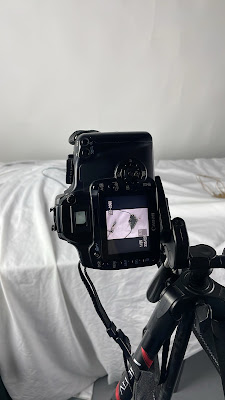
I used a photographic studio to take professional-quality photos of my designs. I set up the table carefully, matching the materials with the background colour. For that process, I used my old Canon D400 camera, as I prefer the photos from a digital camera over those from a mobile phone. At first, I used a white background, but halfway through the photo shoot, I noticed that the white material was blending in with my designs.
Switching the background colour to black not only makes the details of the case stand out more clearly against the contrasting backdrop but also creates a linked visual connection with the background of my website.
For the final step in preparing the photos before adding them to the website, I added a city logo, but only on the bowl. Using Illustrator, I uploaded the logo onto the bowl's photos and adjusted its position to make it look like it was actually there by using Effect > Warp > Arc.
Subscribe to:
Post Comments (Atom)
Reflection: Art Portfolio 2
In Art Portfolio 2, I learned techniques for developing ideas. The classes showed me how to evolve, my ideas, and change and improve ...
-
I'm going to use the macrame technique in my project. This technique involves connecting strings together in special weaves using your o...
-
I stared creating the logo in Canva. From the available templates , I choose the one that would best suit my ethnic jewellery project- Roots...
-
April Vollmer is a New York artist. She studies the mokuhanga technique and Japanese woodcut printmaking after receiving her Master of...


No comments:
Post a Comment