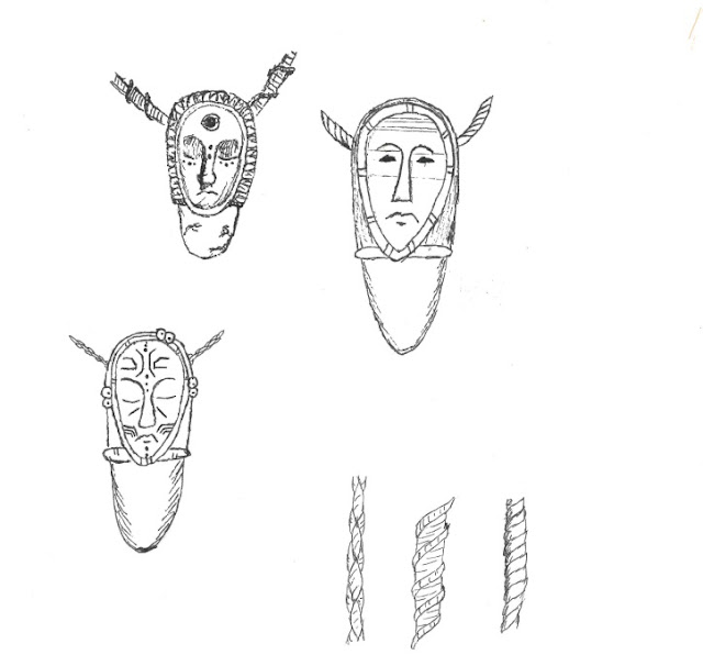
I started my project with quick sketches of the first pendant for the necklace. I wanted it to look like a totem pole. However, I wasn't sure what it would look like in the end, so I made three versions, of which I will choose one. I also made a sketch of the different looks for the necklace, using the macrame technique knots. My intention is to give it a more ethnic look, closer to the vision of what jewelry used to look like, so I will use waxed string. In the next step, I'm going to check out the color options for my project. However, before I start doing it, I wanted to show you a rough sketch.
During the classes, the teacher showed us how to use the basic tools in Photoshop and Illustration. So I decided to practice on what I currently had to make my sketch clearer. I used a scanner to get the best quality possible for my sketch.
From the blending mode option, I chose a shade of black to make my work look like it was sketched on old papyrus. It seems to me that I managed to achieve my intended goal. I did the same for the necklace weave option. It was an interesting experience, using two editing programs that produce really interesting effects. The next step will be to add colors to my work


I will be interested to see how the final designs look on the papyrus background - you may want to drop the opacity slightly to so the background is perhaps slightly lighter to make your designs stand out
ReplyDelete